 Figma
Figma Adobe XD
 Sketch
 Discord
 Twitter
 GitHub
 Blog
Blog
Turn your Figma designs into responsive prototypes3 min read
Reading Time: 3 minutesDesigning for different screen sizes is essential for creating the best user experience. In this article, we will show you how to create responsive prototypes with Figma and Anima.
Turn your Figma designs into responsive prototypes
Responsive prototypes in 3 steps:
- Apply Constraints
- Connect Breakpoints
- Share responsive prototypes
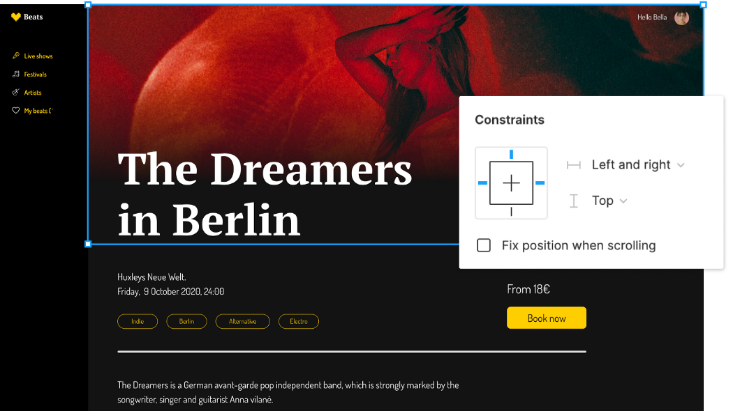
1. Apply Figma’s Constraints 📌
Constraints show how elements should respond as you resize their Frames. This helps you control how your design looks across different screen sizes and devices.
How to do it? It’s simple— Pinning elements!
- Constraints relate to the containing frame.
- You can’t apply constraints to Groups.
- Left / Right / Top / Bottom / Center — Will keep the layer size fixed and pin it to the selected direction of the parent Frame.
- Left and Right / Top and Bottom — Will keep padding from both edges, stretching the layer’s size.
- Scale — Will keep the layer size and position as a percentage of the Frame’s dimensions.
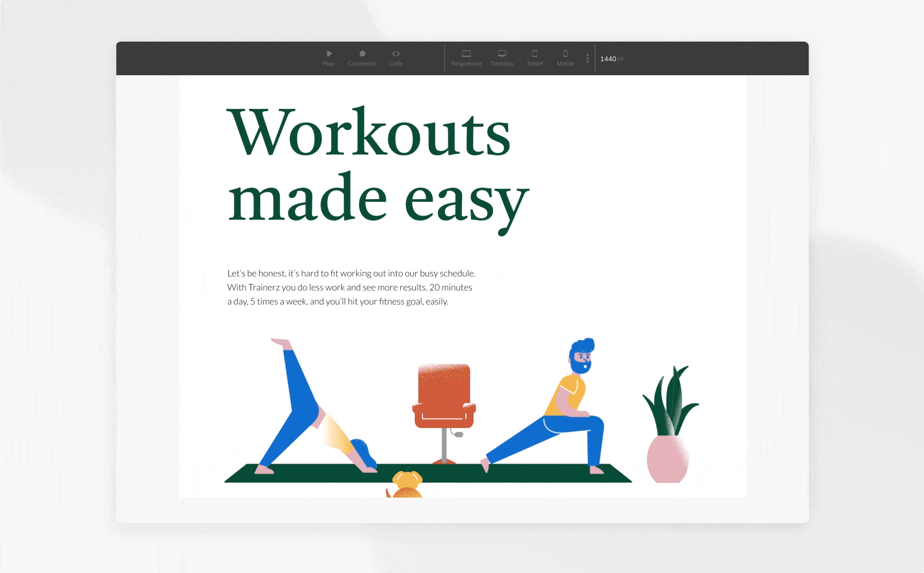
Play with the layout to see the behavior of the constraints
💡 Tip for responsive images
When applying constraints to an image, we want to ensure that the image keeps its ratio and doesn’t stretch. Simply select ‘Fill’ for the fill image type.
That way, the image is always centered, with as much image showing as possible, but never loses its proportions.
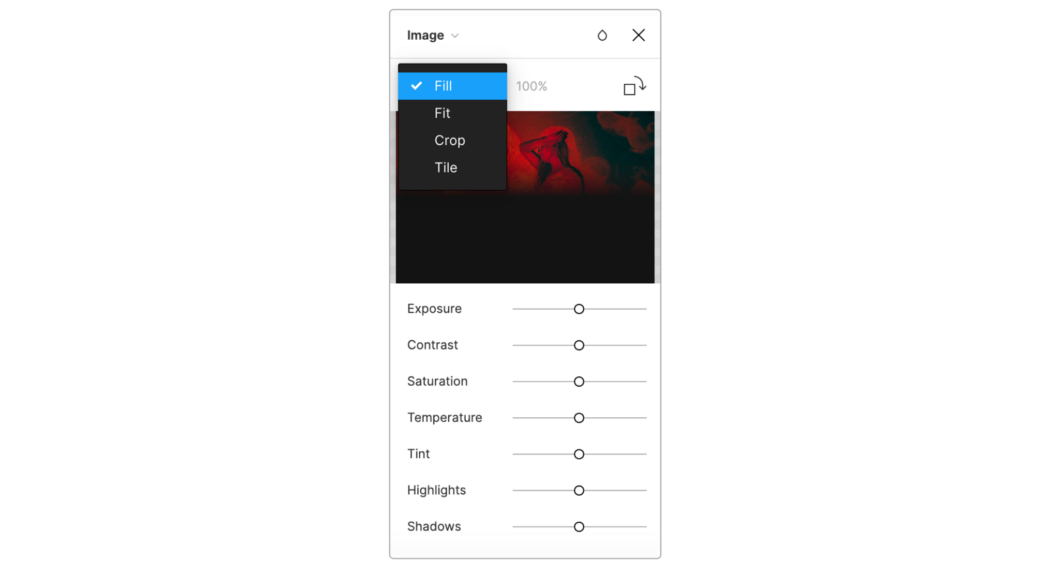
💡 Tip for images — with constraints, ‘Fill’ is the best option for responsive prototypes
Pinned the image to top+left+right
2. Add Breakpoints with Anima 📱🖥
Breakpoints are the point at which your design adapts to different screen sizes.
With Anima, it is super easy to connect several screen sizes on the same screen. So when sharing your design with your team, stakeholders or clients, you simply share a single link with all screens connected as one.
Breakpoints are where the design jumps between mobile, tablet and desktop. The constraints are how it’s going to behave in between the breakpoints.
How to add breakpoints:
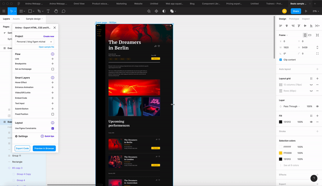
- Start by installing Anima for Figma plugin.
- Open Anima’s plugin, click the plus icon (+) next to breakpoints, and select all the frames you want to connect.
- Select one of the frames, and click ‘Preview in Browser’ to see it running.
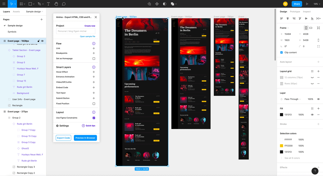
Connecting frames with breakpoints
💡 How does it work?
Design for the smallest size for each breakpoint. Let’s say for example — 320px for mobile, and 1024px for desktop. That means, for a screen size between 320–1023px, you’ll see the mobile design, and for screens over 1024px, you’ll see the desktop design. You can create and connect as many breakpoints as you like.
3. Share a Responsive Prototype 📤
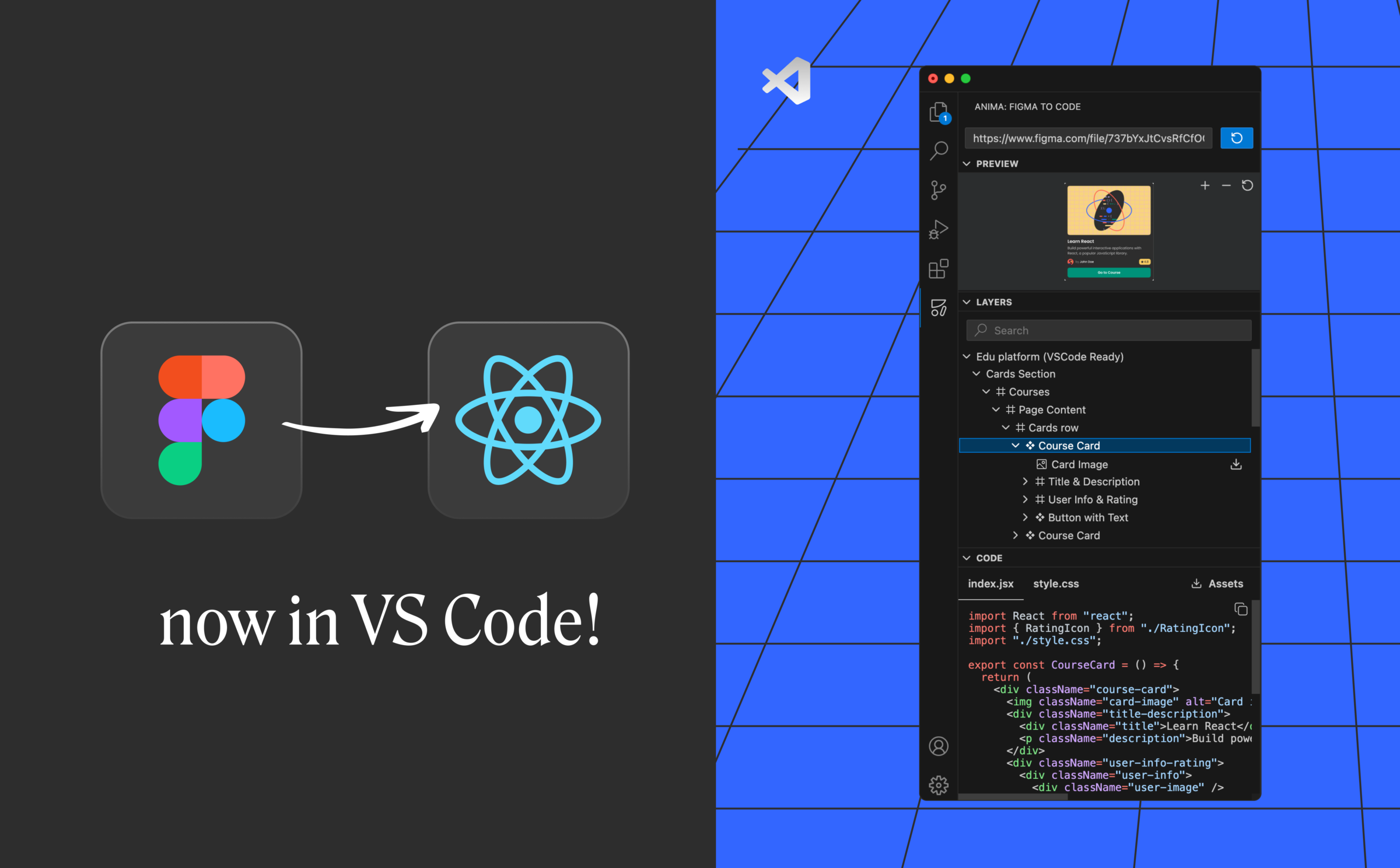
Figma allows you to design with responsive superpowers. But when it comes to responsive prototypes — you need Anima.
Figma’s prototype is an image-based prototype, so it can’t run the native responsive features in it.
Use Anima to share responsive prototypes with Figma’s constraints and Anima’s breakpoints. Anima’s prototypes are code-based, and they can behave the way the final product is supposed to.
You can even take it one step further and share the prototype’s React or HTML code with your developers (Read more here).
How to share a responsive prototype?
- After previewing your prototype in the browser, sync your design by clicking the button ‘Sync to Project’.
- You can always preview it on Play-mode in Anima.
- Click the ‘Share’ button, and choose your share preferences. You can share it with your team by inviting members to collaborate in Anima. Or to share it with a public link.
As always, we’re excited to hear your feedback!
Join the discussion or show off your designs on Facebook, Twitter, Slack, Instagram. Vote for new features at UserVoice.
Stay creative!
❤️ Anima team

 in TLV.