
 Figma
Figma API
API Web to code extension
 Adobe XD
 Discord
 Twitter
 GitHub
Design systems: what they are, why you need one, and where to start9 min read
Reading Time: 7 minutesIf you’re wondering what a design system is and how establishing one can impact your product or organization, you’ve come to the right place.
Digital products are getting larger and more complex to meet soaring demand—and need to be delivered faster than ever for organizations to stay competitive. This means the traditional design-to-development process, where designers build each screen from scratch and developers translate them into code, isn’t fast or consistent enough to build those products at scale.
Design systems solve this problem by creating a single source of truth between design and code—so that designers and developers build products with a shared, defined set of reusable components and standards. Robust design systems can provide a nearly-lossless handoff from design to production with minimal effort from either side. This ensures consistency across complex products and distributed teams, streamlines development, and creates an optimal user experience for your product.
In this article, we’ll answer the following questions so you’ll come away with a clear understanding of what a design system is, how you or your organization might benefit from one, and where to start.
- What is a design system?
- What is included in a design system?
- Why use a design system?
- How to create a design system
- How to manage a design system
TL;DR
Design systems:
- streamline production and improve consistency by giving designers, developers, and teams a shared set of components and standards—one in images and one in code.
- consist of component libraries, pattern libraries, style guides, and code documentation.
- can be built from scratch or adapted from open-source libraries like MUI, Ant Design, and iOS to make the process more manageable.
- require continuous maintenance, updating, and syncing between design and code—which can be expensive for orgs with limited resources.
- are increasingly being automated to help smaller orgs reap the benefits with fewer maintenance costs, and larger orgs manage increasingly complex design systems at scale.
What is a design system?
A design system is like a box of Lego blocks for a product team. It’s a synced library of prefabricated components and standards—one in images and one in code—that both designers and engineers can use as a single source of truth. When design and production use the same set of components and standards to build products, they significantly reduce handoff friction while increasing efficiency and consistency.
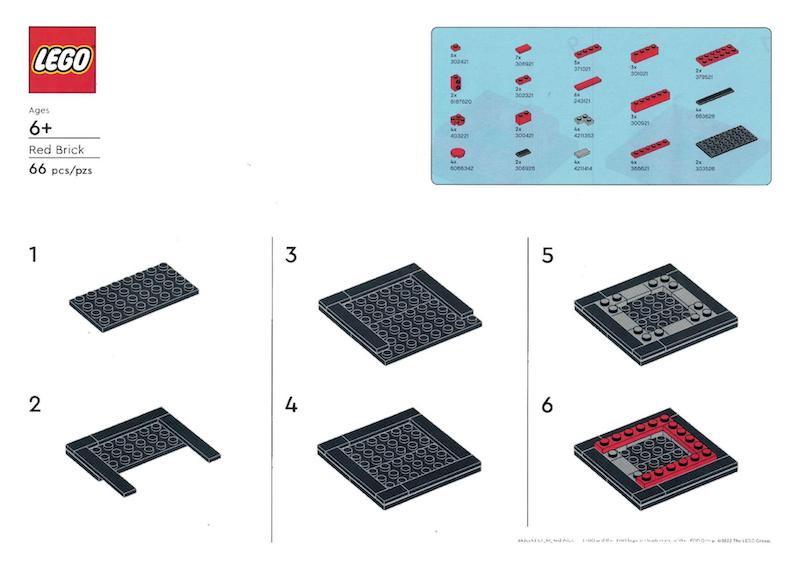
Instructions from a set of lego blocks
What is included in a design system?
Design systems come in many different shapes and sizes, but the most conventional examples consist of the following elements: component libraries, pattern libraries, and style guides.
We’ll explain each of these elements using examples from three of the most popular design systems—Material UI (Google), Ant Design, and iOS (Apple).
1. Component library
A component library is a collection of all components within a design system—aka the modular building blocks that form the product. When properly synced between design and code, a component library serves as a single source of truth for designers and developers. Although the contents of a component library can vary based on a company’s needs and capacity, it typically includes the following elements:
- Components
- Component definitions
- Component variants (states)
- Best practices
- Code snippets and documentation
Components
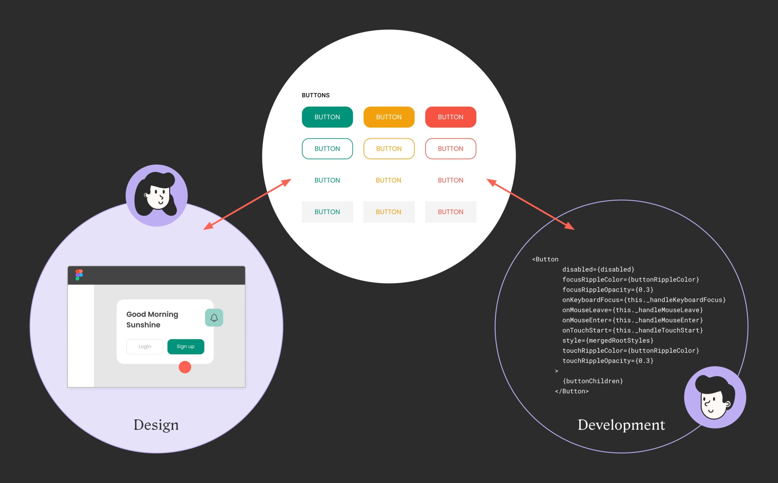
Components are the smallest building blocks in a design system. They include elements like buttons, chips, dividers, and input fields. Designers work with image-based components in tools like Figma and Adobe XD, while developers work with corresponding code-based components in tools like GitHub and Storybook.
Component definitions
Component definitions tell you when to use a particular component. Design systems define every use case for each component to help teams build consistent experiences that work the way users expect. Here’s how MUI defines a button component:
A button component definition from Material UI
Component variants (states)
Variants—also referred to as states—are components that are similar to each other but with minor differences. They’re typically used to represent different styles and states of a base component. For example, a basic button component has primary, secondary, pressed, disabled, and rounded variants, to name a few.
Without variants, component libraries would have to accommodate hundreds, if not thousands, of unique UI elements. However, variants branch out from basic fundamental components to keep component libraries simple, organized, and easy to maneuver.
Many component libraries provide style guidelines and examples for each variant.
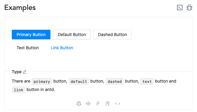
Button component variants from Ant Design
Best practices
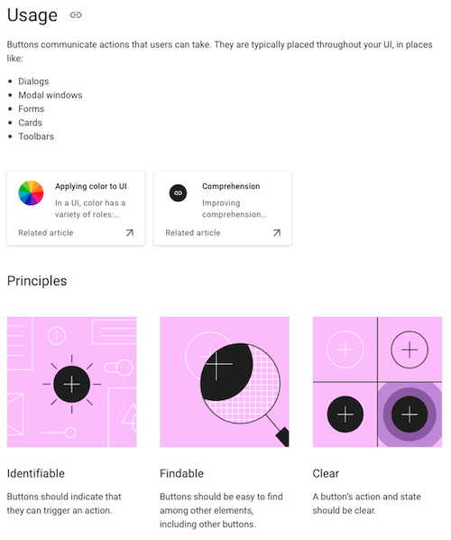
While component definitions tell you when to use a component, best practices tell you where and how to use them. Best practices guide you through specific use scenarios with detailed descriptions for consistent implementation.
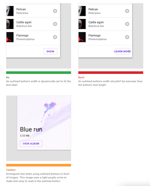
Button component best practices from Material UI
Code snippets and documentation for developers
Code snippets present actual code for each component in any supported frameworks and languages. Design systems also include API documentation that explains how to modify these code snippets. This helps developers accurately and efficiently implement the style and functionality of the design in the final product.
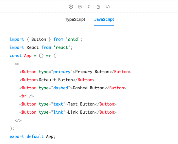
Code snippet for an Ant Design button component
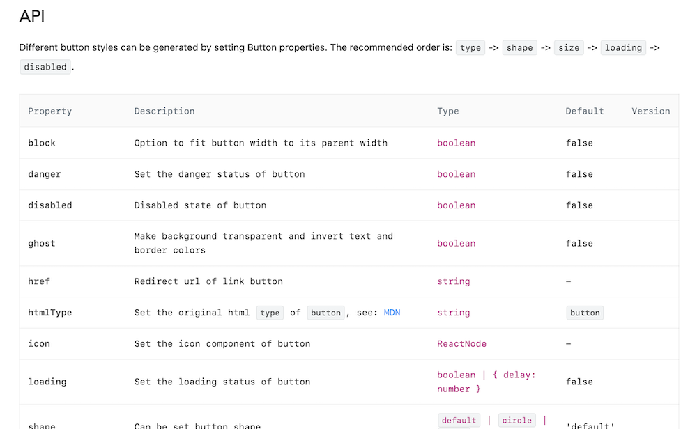
API documentation for an Ant Design button component
2. Pattern library
Patterns are reusable building blocks made up of smaller components arranged in specific layouts. Cards, for example, are made up of button components, images, and text with defined spacing between elements. There is no universal way to distinguish patterns from components. In fact, they’re often not put in separate categories at all, since they’re really just complex components comprised of more basic ones.

Pattern example: a card layout made up of different MUI components
3. Style guide
A style guide is a comprehensive manual on how to use design system components together to ensure the best user experience. They’re separate from individual component guidelines, and cover things like how to create intuitive component patterns and where to request certain user actions in a flow.
There’s a spectrum of how strict a style guide can be. For example, Apple Human Interface Guidelines provide extremely detailed design patterns and themes, whereas Ant Design is less prescribed. The former will result in a more uniform, proven-to-work user experience, while the latter gives more room to explore, but with greater uncertainty.
Style guide documentation from iOS design system
Why use a design system?
Advantages
The advantages of using a design system can be narrowed down to efficiency, accuracy, and consistency.
Build and scale efficiently
One of the key metrics of product success is the speed of delivery and ability to scale. The option to reuse prefabricated components from a library is an invaluable advantage for both designers and developers. Designing commonly used UI elements becomes a drag-and-drop process for designers, and implementing features becomes a copy-and-paste process with a few tweaks for developers.
Deliver accurately
Designers and developers build products with a shared set of reusable components and standards, so designs don’t get lost in translation. Instead, products look, feel, and function exactly as designers intended with minimal iterations.
Provide consistent user experience
Using a design system ensures a clear and predictable user experience across every product, feature, and touchpoint in an organization. That’s because design systems utilize a uniform visual language for every asset, so users know exactly how to navigate and what to expect—regardless of where they land.
Disadvantages
Design system cost
Like any product, design systems are constantly evolving to meet users’ needs and organizations’ business goals, and building and managing them requires a dedicated team. A design system can have thousands of components and variants to build and manage—which only grows as your product becomes more complex. And while manually syncing those components between design and code is inefficient and prohibitively expensive for leaner organizations, there are a growing number of options that automate the process.
Design systems can constrain creativity
Designers may be less likely to explore new approaches when they’re limited to a design system. This potential downside, however, pales in comparison to the overall benefits of streamlined, scalable product development for organizations. Plus, a robust design system should provide ample flexibility for designers to propose new solutions.
How to create a design system
Build a design system from scratch
Building a design system from scratch is expensive, time-consuming, and typically requires a dedicated team. Designers build all of the image-based components and their variants, and developers turn them into a parallel set of code components. Design system teams also develop a set of standards ensuring components are implemented in a defined, consistent way. Because of the resources involved, building from scratch is typically reserved for large organizations with plenty of human and financial capital.
Adapt an open-source design system
Adapting an open source design system—like Material UI or Ant Design—is a great way to get up and running with a small team or a tight timeline. You can customize open-source components’ colors, typography, and spacing to match your brand and visual language, and have a robust design system with a fraction of the time and resources it takes to build one from scratch. Plus, extensive documentation for developers makes it a breeze to implement the design system in code.
Adapting an existing design system is the best option for lean organizations, as well as more established companies that simply want to move faster.
How to manage a design system
Manual design system management
Design systems are never “done.” They’re constantly evolving as new components and variants are added and old ones are changed. Updating design components and code components manually—and making sure they’re in sync—often requires a dedicated team. It’s expensive and time-consuming, which makes design systems inaccessible to organizations with limited human and financial resources.
As design systems continue to grow in size and complexity, the cost of manually maintaining them will soon outweigh their benefits.
Design system automation
There are an increasing number of tools that automate design system management.
Frontier by Anima automates the integration of design systems into development by directly converting Figma designs into complete, ready-to-use code components. With its Code Injection feature, Frontier identifies existing code, generates missing elements, and injects them into your project along with all necessary files and assets. This process eliminates the need for manual copying and pasting, ensuring a seamless and efficient design-to-code workflow, and maintaining consistency across your project.
Get the benefits of a robust design system—without the costs
FAQ Snapshot
{
“@context”: “https://schema.org”,
“@type”: “FAQPage”,
“mainEntity”: [{
“@type”: “Question”,
“name”: “What is included in a design system?”,
“acceptedAnswer”: {
“@type”: “Answer”,
“text”: “1. Component library
A component library is a collection of components that come together to form the product. Components include elements like buttons, chips, dividers, and input fields.
Designers work with image-based components in tools like Figma and Adobe XD, while developers work with corresponding code-based components in tools like GitHub and Storybook.
Component libraries can also include use guidelines, but it’s not a given.
2. Pattern library
A pattern library is essentially just collection of complex components. Patterns are reusable building blocks made up of smaller components arranged in specific layouts. Cards, for example, are patterns made up of button components, images, and text with defined spacing between elements.
3. Style guide
A style guide is a comprehensive manual on how to use design system components together to ensure the best user experience. They’re separate from individual component guidelines, and cover things like how to create intuitive component patterns and where to request certain user actions in a flow.”
}
},{
“@type”: “Question”,
“name”: “What is an open source design system?”,
“acceptedAnswer”: {
“@type”: “Answer”,
“text”: “An open source design system is the set of components, standards, and documentation an organization uses to build its own products, and has made available to the general public.
These organizations are generally mature, and their components and standards have been thoroughly tested and implemented. That means teams and organizations with fewer resources can easily adapt and built upon these open source libraries to create robust, branded design systems of their own in a fraction of the time.
Some popular open source design systems include Google’s Material UI, Apple’s iOS, and Microsoft’s Fluent Design System.
Here’s a repository of open source design systems.”
}
}]
}
What is included in a design system?
1. Component library: a collection of reusable elements (i.e. buttons, chips, dividers, and input fields) that come together to form the product.
2. Pattern library: a collection of complex components (smaller components arranged in specific layouts). Cards, for example, are patterns made up of buttons, images, and text with defined spacing between elements.
3. Style guide: explains how to use design system components, colors, typography, and other visual elements to ensure good UX and brand continuity.
What is an open source design system?
An open source design system is the set of components, standards, and documentation an organization uses to build its own products, and has made available to the general public.
These organizations are generally mature, and their components and standards have been thoroughly tested and implemented. That means teams and organizations with fewer resources can easily adapt and built upon these open source libraries to create robust, branded design systems of their own in a fraction of the time.
Some popular open source design systems include Google’s Material UI, Apple’s iOS, and Microsoft’s Fluent Design System.