 Figma
Figma API
API Web to code extension
 Adobe XD
 Discord
 Twitter
 GitHub
 Blog
Blog
Breakpoints with Anima: From Figma design to Responsive Website4 min read
Reading Time: 3 minutesAnima easily converts Figma designs into responsive HTML or React code, by letting users set breakpoints (Media queries) to a Figma project.
Imagine you’ve just poured hours into perfecting a website design in Figma. It looks stunning on your desktop. But then you check it on a smartphone, and it zooms out so badly that letters are just pixels. So, you make multiple prototypes for each resolution and share multiple links with stakeholders and engineers. In the best case, you’re getting one resolution right, and others are far from being pixel-perfect. This scenario is all too common in the digital design world, where supporting multiple resolutions is not just a challenge; it’s a necessity. This is where breakpoints come in.
Using breakpoints, Anima ensures that your design automatically adjusts to look its best, whether it’s being viewed on a compact smartphone, a tablet, or a widescreen monitor. The right layout will show.
What are Breakpoints?
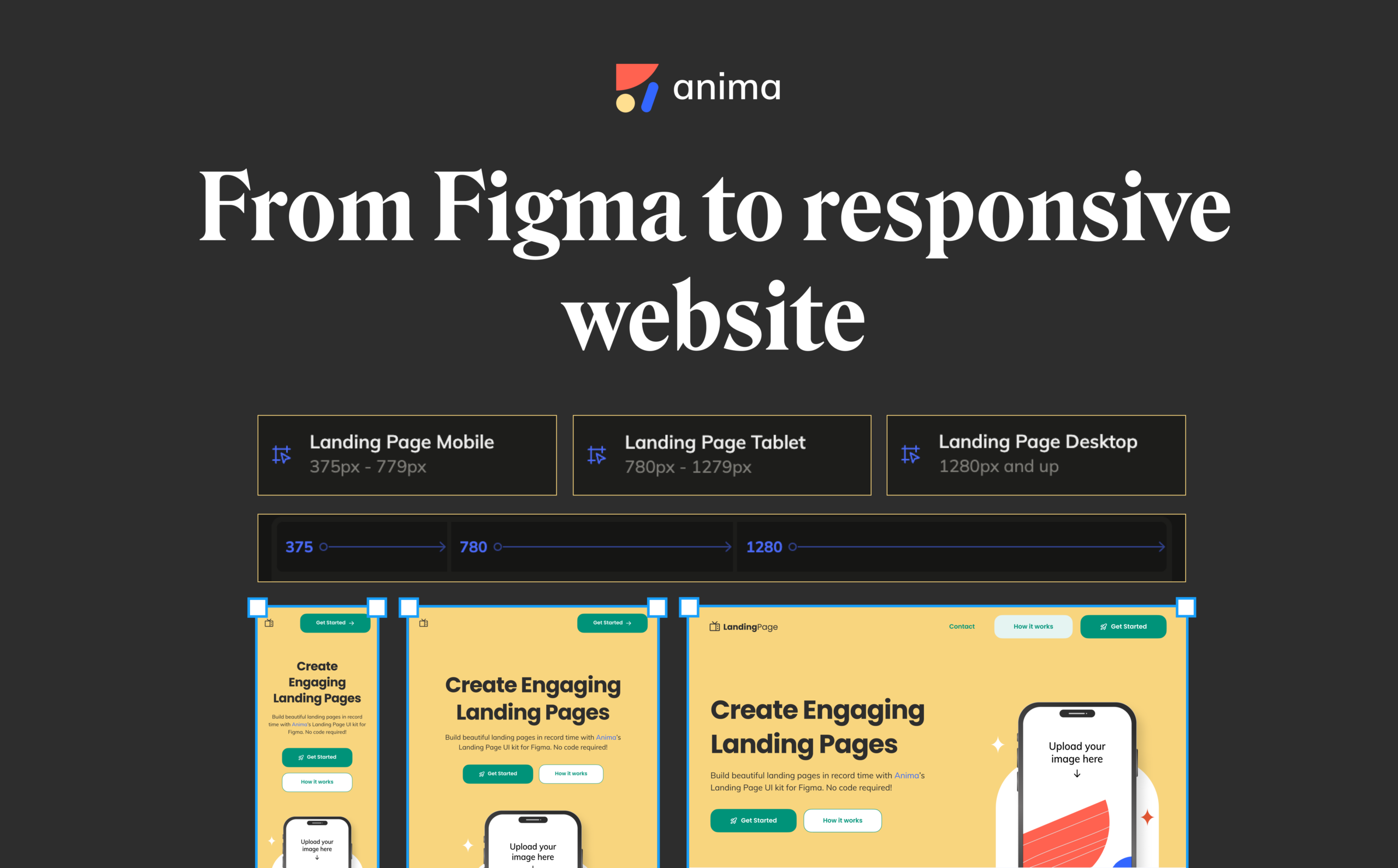
A breakpoint is a specific point where a website’s content and design will adjust to accommodate the screen size or resolution it’s being viewed on.
Today, the convention is to have a different artboard representing the page layout for Desktop, Mobile, and sometimes even tablet or a wide desktop. Each of these artboards stands for a breakpoint.
Why Should You Use Breakpoints?
- Enhanced user experience – By ensuring that your website or app looks great and functions well on any device, you cater to a wider audience, making your design more inclusive and user-friendly.
- Readability and clarity – Breakpoints allow designers to adjust not just the scaling of elements, but also their positioning, visibility, content, and even functionality, depending on what is the most appropriate for the device resolution. If you are building a landing page, it all boils down to a better conversion.
- SEO – Search engines favor mobile-friendly websites. A responsive design is more likely to rank higher in search results, increasing visibility and traffic.
- Communicating with stakeholders or clients – Even during the design process, Breakpoints allow you to share a single link to all resolutions, helping you close a sale or impress stakeholders before involving engineering.
Breakpoints are a vital tool in the modern designer’s toolkit, allowing for the creation of responsive, user-centric designs for any screen. Ensuring that the end product is accessible and engaging for all users, regardless of their device.
How to Use Breakpoints
Here’s how to use Breakpoints and create a responsive website with Figma:
- Design with multiple layouts
The process begins in Figma, where designers create variations of their pages for different screen sizes. Typically, at least two or three versions, such as mobile, desktop, and tablet.
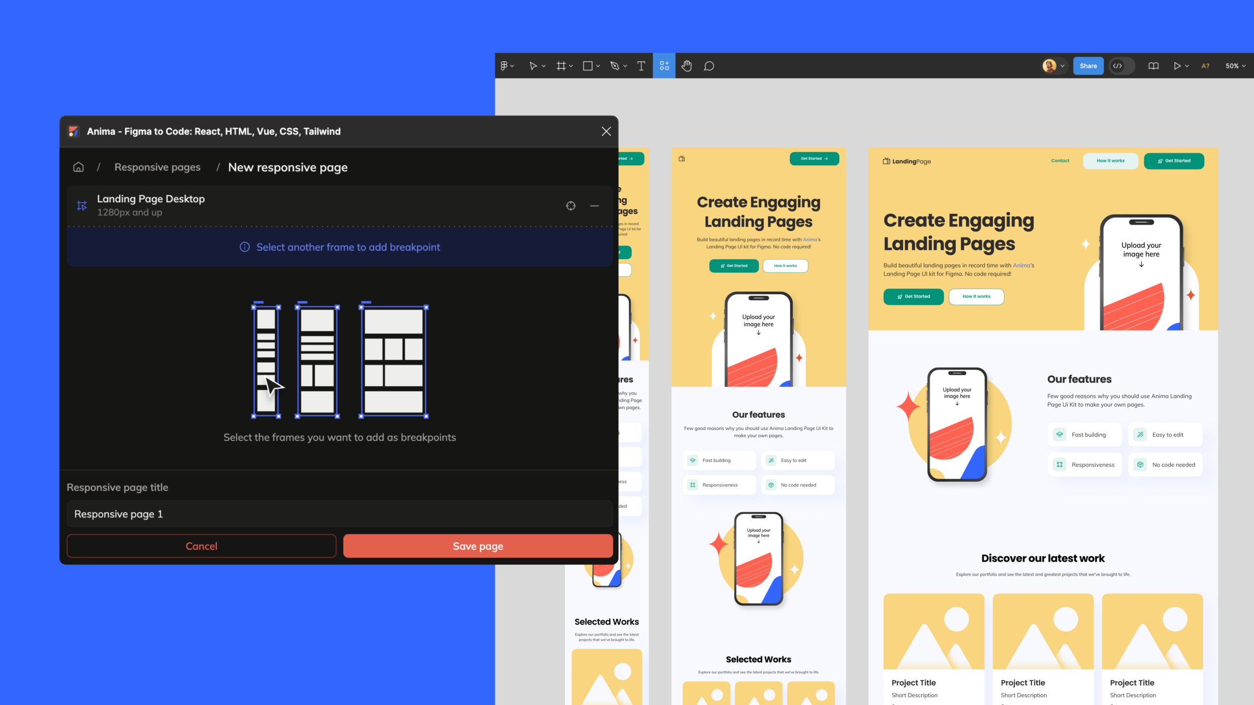
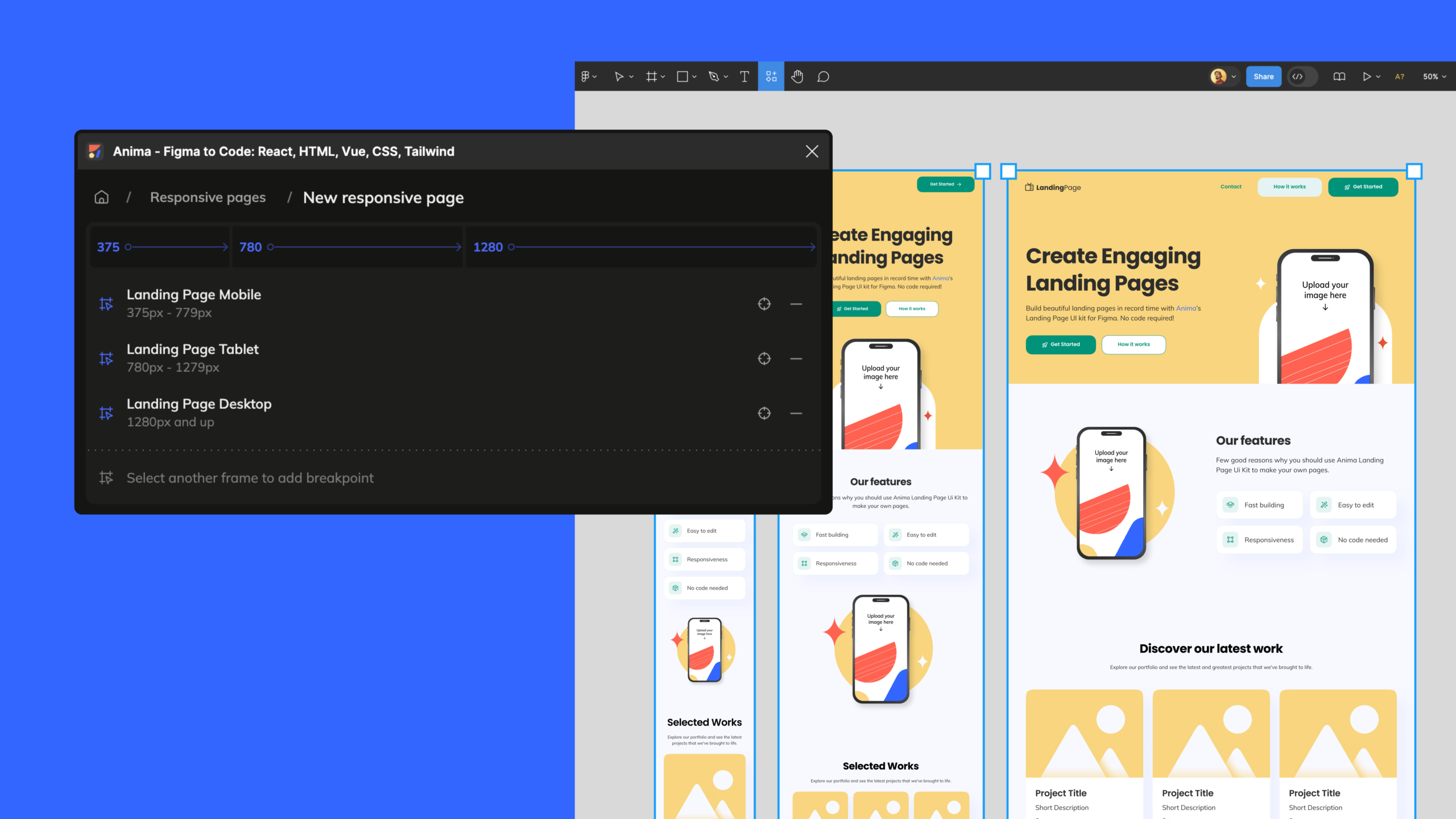
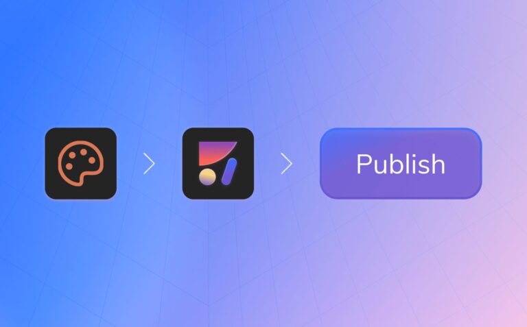
- Connect artboards with Anima’s Breakpoints feature
Select all the artboards of the same page (i.e. “homepage mobile” & “homepage desktop”), then use Anima’s plugin for Figma, and click “Responsive pages” → “+” → “Save”. - Publish a public link or Export code
- With your breakpoints set in Anima, you’re ready to convert your designs into responsive HTML / React code.
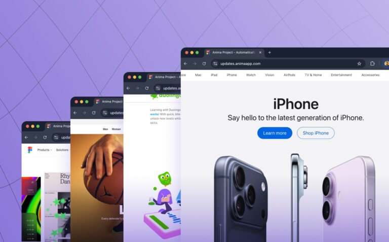
- Click “Get code” to download an HTML/React code package. The generated code pack contains all the necessary code and assets to render the website responsively, adjusting layouts automatically based on the browser window’s size. This code is designed to reflect your Figma designs accurately across all specified breakpoints.
- Or, click “Publish” to get a public link under animaapp.io, or even under your own domain.
More on Breakpoints
- Multiple screens and Figma links – Anima supports Figma prototype links out of the box, and multiple pages may have their breakpoints.
- Breakpoints & Auto-layout – Figma auto-layout is also supported. And using AL would give an even better experience on your pages.
- The CSS behind the scenes – Anima uses CSS Media queries to jump between your different layouts according to screen width.
- What width should I have my artboards for best performance?
- The artboard width should represent the minimum width of this layout.
- I.e. using 1200px for Desktop and 350px for Mobile – This would show Mobile layout for any screen with less than 1200px width. Below 350px, it’ll keep a minimum of 350px (usually zoomed out on mobile browsers rather than scrolls).
Transforming a Figma design into a responsive website with Anima streamlines the development process, allowing designers and developers to work closely from the initial design phase to the coding phase.
Want to read more?
How to export Figma to HTML / CSS
Ready to start for free?
Create an Anima account
