How to build a killer UI/UX portfolio using design best practices8 min read
Reading Time: 5 minutesIf you’re looking for your first UI/UX design job, there’s a lot to consider. Will you work at a startup or at a more established company? Will you focus on UX research, UI design, or both?
Not sure which skillset to highlight? Check out this article comparing UX and UI.
Regardless of the direction you choose, one thing’s for sure. If you want to land an interview, you’re going to need a great portfolio.
In this article, we’ll discuss why you need a UX/UI portfolio, what it should include, and how to make yours stand out using design best practices.
Why do you need a junior UI/UX designer portfolio?
As a UI/UX designer, your portfolio is your most important personal branding document. While your resume or CV describes your skills, your portfolio demonstrates them. You can lay out work samples, illustrate your approach, and show potential employers who you are and what you’re about.
What you might not realize, however, is that your most important work sample is the portfolio itself.
Not sure where to start? Try our live portfolio template for Figma for some creative inspiration.
Why is UI/UX portfolio design so important?
Work samples aren’t interactive
In a UI/UX portfolio, each work sample is presented as a case study; a static mockup of your design accompanied by a detailed breakdown of your process. This allows you to highlight your:
- UX research skills
- route to the final product
- ability to speak a cohesive visual language`
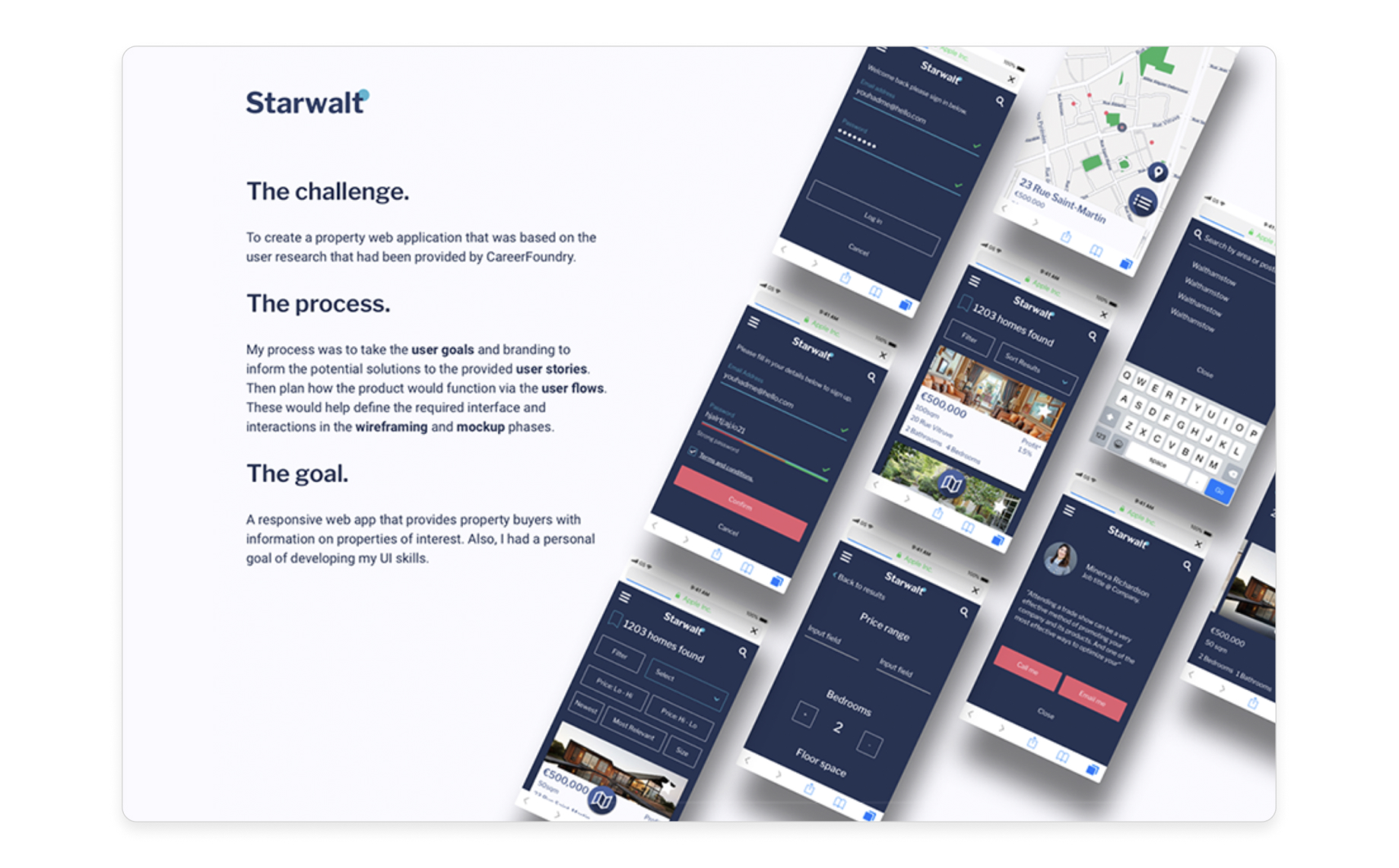
An excerpt from a UX case study with static mockups (source)
So what’s missing?
Since case studies present static mockups of your prototypes, recruiters have no way to gauge how usable or intuitive they are in real life.
That’s where your portfolio comes in.
UI/UX portfolios are user interfaces
Your portfolio website is a fully interactive interface that you’ve designed—and potential employers are its target users.
Recruiters will only spend a few minutes reviewing your portfolio site, so its usability will be their best indication of your design chops.
But how can you be sure your portfolio aligns with recruiters’ goals? You’ll need to conduct user research.`
How to conduct user research for your UI/UX portfolio
You can’t conduct traditional user research with potential employers. Luckily, the user insights you need are already at your fingertips.
Here are 3 excellent resources for user insights:
- Job postings:
Recruiters have already done the work for you. Job postings provide details about the company culture, structure, and goals. You’ll also get a bulleted list of their wants and needs, indicating which skills and attributes you should be highlighting in your case studies. - LinkedIn:
LinkedIn pages are a great place to do competitive research. Here, you can access a list of a company’s employees. Look for other designers, then check out their profiles and portfolio websites for a good idea of what works. - Company website and existing assets:
Read the mission statement, peruse the content, and get a sense of each employer’s visual brand language. Know who your target employers are and how they speak. Craft your visual and written content to appeal to them.
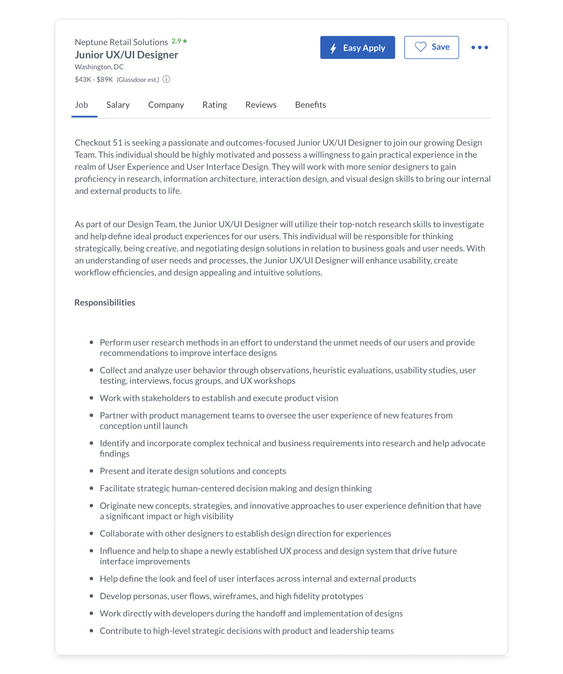
A junior UX/UI job posting—tons of user insights! (glassdoor)
What to include in a UI/UX portfolio
Your portfolio’s user experience is as important as its contents, so don’t distract recruiters with unnecessary features. Here are the only 3 things your portfolio should include:
- Intro, about statement, and contact info→ tell employers who you are, what you do, what they can expect if they work with you, and how to get in touch
- Case studies→ show employers what you did, how you did it, and what tools you used (like Figma, Adobe XD, and Anima) with no more than two to four of your best, most relevant case studies (make sure to highlight your strengths as a researcher, designer, or both)
- Professional social media and web links→ include your LinkedIn account, industry-specific accounts or websites (like a design-focused blog or Instagram page), a link to your resume or CV
The portfolio example below is intuitive and uncluttered, with all relevant content accessible from the homepage:
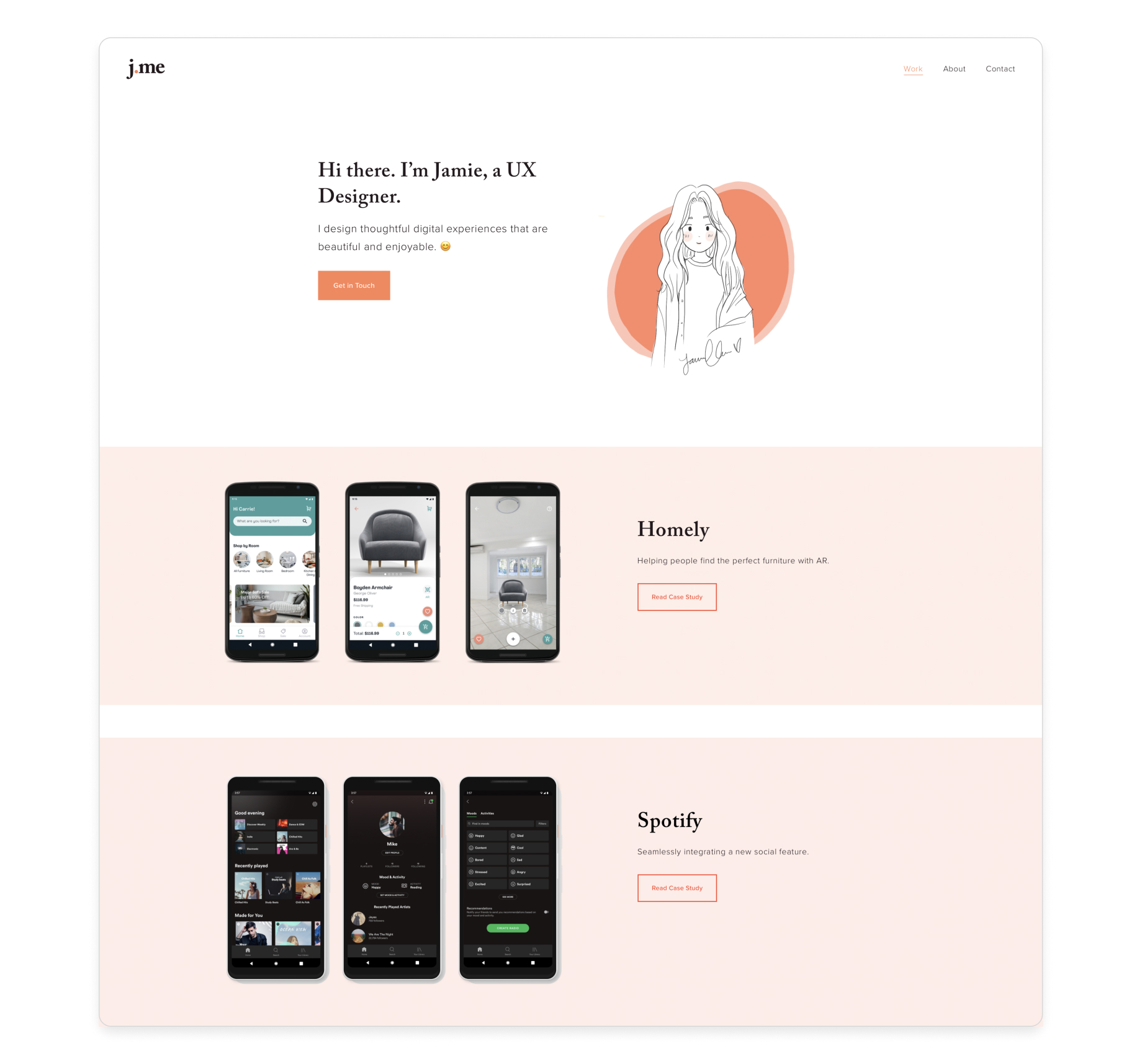
A clean, intuitive portfolio with just what recruiters need (source)
7 design best practices for UI/UX portfolios
Employers will assess your about statement, your case studies, and maybe your social media and web links. But they’ll pay equal attention to how intuitive and navigable your site is.
Here are 7 design best practices for a frictionless, user-friendly portfolio:
1) Make the user the focus
- Design for your users—in this case, prospective employers
- Learn what they want, what information they need, and what they hope to achieve (use job postings, LinkedIn, and company websites)
2) Use a logical structure
- Think about what recruiters need to know and in what order
- Start by introducing who you are and what you do, then show how you do it with well-organized case studies
3) Keep it simple and strive for clarity
- Avoid unnecessary graphics, animations, and interactions that complicate the user journey
- Make sure recruiters can determine who you are, what you’ve designed, and what your process is within the span of a few minutes
- Make all essential components visible and scannable on your homepage
4) Minimize steps and actions per screen
- Keep as much content as possible to a single page
- Make more detailed content (like expanded case studies) accessible in a single click
- Make it clear and simple for recruiters to reverse actions and return to your homepage
- Avoid forcing users to navigate through carousels or image series to view your mockups
5) Be consistent
- Reuse design components throughout your interface (buttons, menus, icons)
- Design components should resemble those used by other websites (don’t make recruiters learn new conventions, which will waste precious time)
6) Make your site responsive
- You don’t know how or with what device a recruiter will view your portfolio
- Make sure your site adapts to any screen—employers will value this ability
7) Get user feedback
- You can’t user-test potential employers, so get feedback from friends, family, classmates, instructors, and design communities on platforms like Reddit and Facebook
- Use this feedback to improve usability, and keep iterating until your portfolio is frictionless
How to build a killer UI/UX portfolio | TLDR
- UI/UX portfolio work samples are static mockups that don’t indicate the usability of the final products they represent
- A portfolio website is an interactive interface you’ve designed, and recruiters are its target users
- An intuitive interface where recruiters can efficiently assess your skills and background is the best indication of your ability to create a seamless user experience
- Lead with the user (recruiters), and implement the same UX/UI best practices you’d use in any design
- Make sure your portfolio is: user-centered, logically structured, simple and clear, navigable with minimal steps and actions, consistent, responsive, and user-tested
FAQ Snapshot:
What should be in a UX portfolio?
Recruiters will only spend a few minutes scanning your portfolio (if you’re lucky) so don’t distract or overwhelm them. Your UX/UI portfolio should only include 3 things:
- Your personal introduction, about statement, and contact info
- Links to your professional social media accounts and downloadable resume/CV
- No more than 2-4 case studies exhibiting your best work
What are UX portfolio best practices?
Here are 7 design best practices for a user-friendly portfolio:
- Make the user the focus (satisfy recruiters’ wants, needs, and objectives)
- Use a logical structure (intro→ about statement→ case studies)
- Keep it simple and strive for clarity (Don’t distract recruiters with irrelevant content)
- Minimize steps and actions per screen (few clicks, easy journey to desired content)
- Be consistent (have a design system, reuse similar components, follow conventions)
- Make your site responsive (your portfolio site should look good on any screen)
- Get user feedback (friends, family, classmates, instructors, online design communities)

 Figma
Figma Adobe XD
 Blog
Blog