 Figma
Figma API
API Web to code extension
 Adobe XD
 Discord
 Twitter
 GitHub
 Blog
Blog
Producing Flexbox responsive code based on Figma, Adobe XD, and Sketch constraints4 min read
Reading Time: 4 minutesResponsive layouts allow you to support multiple screen sizes and design amazing products that look great on any screen size and device.
For all major design tools (Figma, Adobe XD, and Sketch) designers can add “constraints” that define how the design will look on any device.
Now, and for the first time ever, Anima can automatically translate these designer-defined constraints into developer-friendly code—right from your design tool! That means the websites and web apps you design (like this blog we created in Figma) will adjust to any screen size.
Define constraints within your design tool
See the Pen
Anima clean code by Amir Lellouche (@AmirLellouche)
on CodePen.
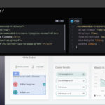
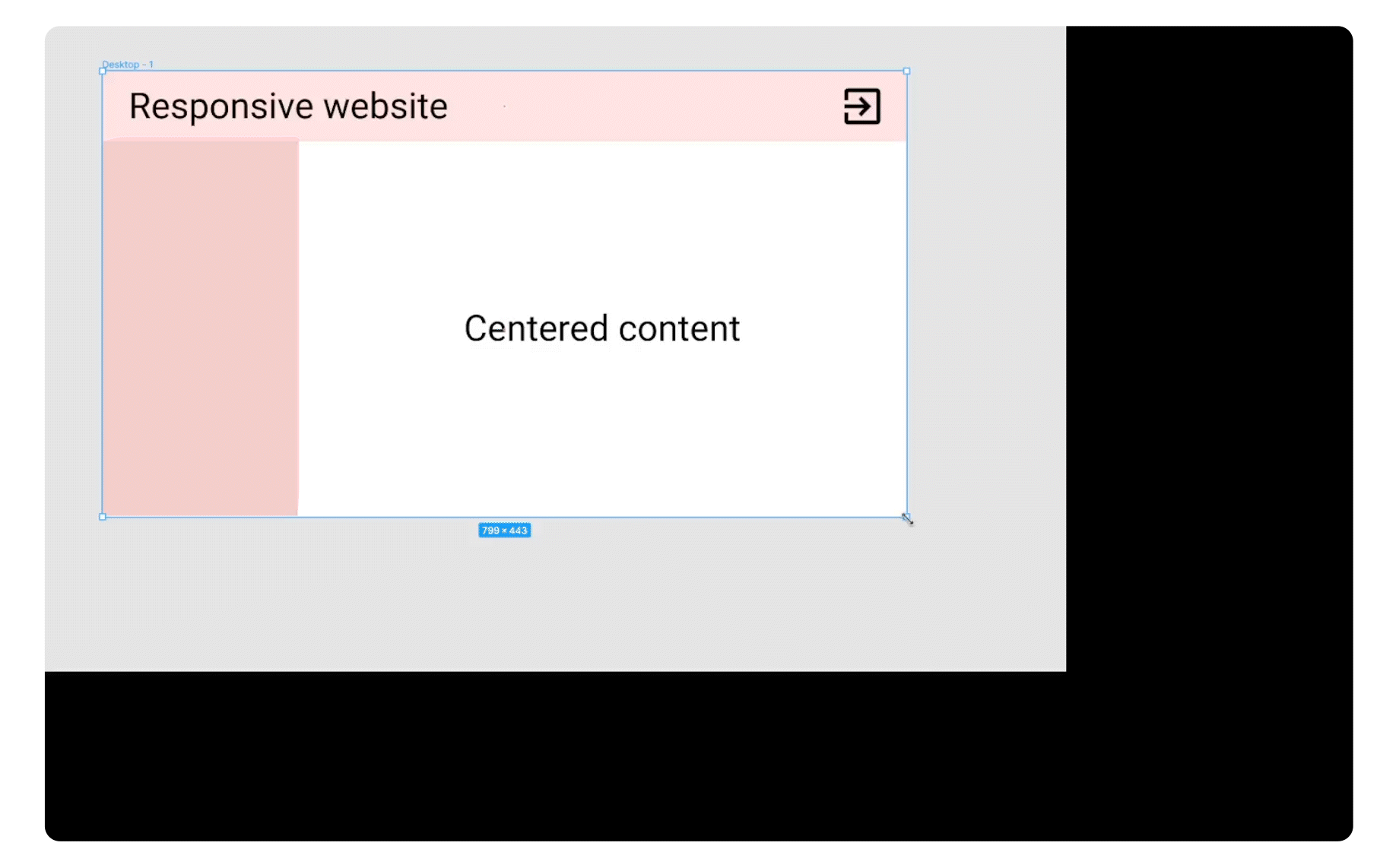
Get flexbox responsive code out of Anima
As a developer, when you use Anima to generate code for you, you won’t need to worry about the tedious Flexbox properties needed to meet your designer’s responsiveness requirements. This will free up your time to do more “hardcore” development work while reducing friction and knowledge gaps between the designer and dev team. Now the designer can directly influence the responsive behavior of the final product without bothering you to write the code.
Note: We do not support breakpoints (media queries) at the moment for Flexbox, but stay tuned as Anima is constantly evolving 😉
Anima converts Figma, Adobe XD, and Sketch constraints into Flexbox CSS!
We are very happy (and proud!) to announce that Anima now supports constraints in its auto-generated code, which will allow developers to generate an amazing looking front-end with as little effort as possible.
Get automatically generated Flexbox responsive code from Anima
Our algorithms find ways to support all kinds of constraints. By the way, we’re constantly learning and improving. If you find unsupported constraint combinations or think that some code could be generated more efficiently, please let us know at feedback@animaapp.com.
What is responsive and adaptive design?
Users are now viewing websites on a wide selection of screen shapes and sizes, from ultra-wide TV screens to tablets and smartphones. In order to define the design’s look and feel for each screen, designers have two options:
- Adaptive: craft a different design for every screen type, or
- Responsive: create a single, flexible design that automatically stretches or shrinks to fit the UI elements to any screen
Adding constraints in Figma, Adobe XD, and Sketch
If the designer prefers to use the responsive approach, they need to define constraints within their design tool of choice. It works a bit differently in each design tool, but the concept is the same (see tutorials for Figma, Adobe XD, and Sketch).
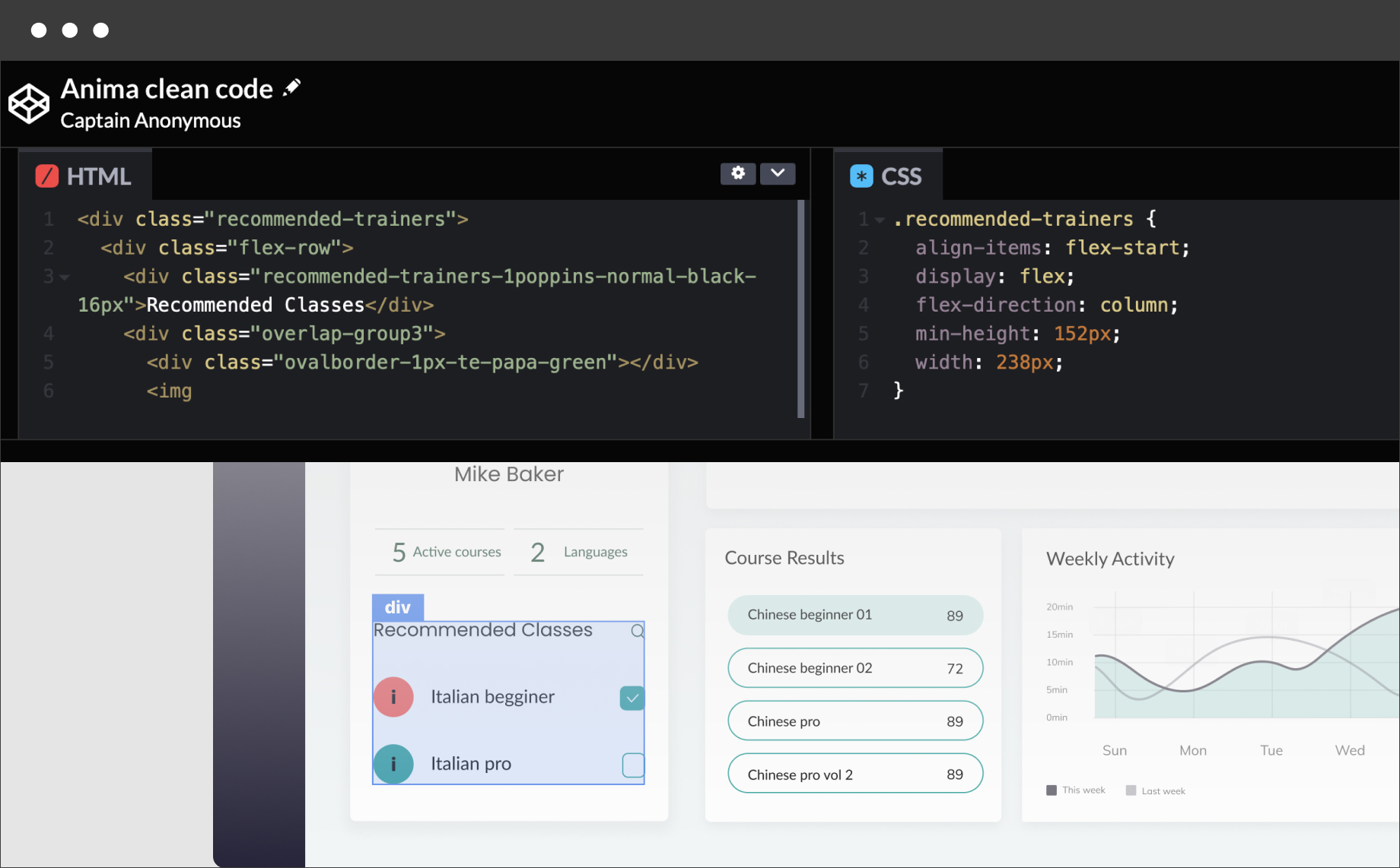
Roughly speaking, constraints allow the designer to set the position and the size of an element relative to its “parent” position and size. In the following example, you will see that the top bar (i.e. the element) changes when we change the size of the frame (i.e. its parent).
A responsive design example in Figma
How to get responsive flexbox code from Anima
With Anima, getting responsive flexbox code based on Figma, Adobe XD, and Sketch constraints can be done in a few simple steps:
Step 1: add constraints to your design using Figma, Adobe XD, or Sketch
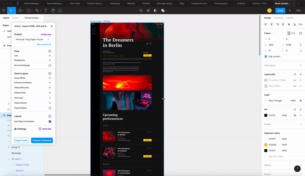
Step 2: for designers – sync your design and constraints to Anima
- Open the Anima plugin in your design tool
- Click the ‘Responsive’ tab at the top of the plugin window
- If using Figma, check the box labeled ‘Use Figma Constraints’—otherwise skip to number 4

Sync your design and constraints to Anima - Sync your design to the Anima platform
-
- how to sync a draft in Figma
- how to sync a draft in Adobe XD
- how to sync a draft in Sketch
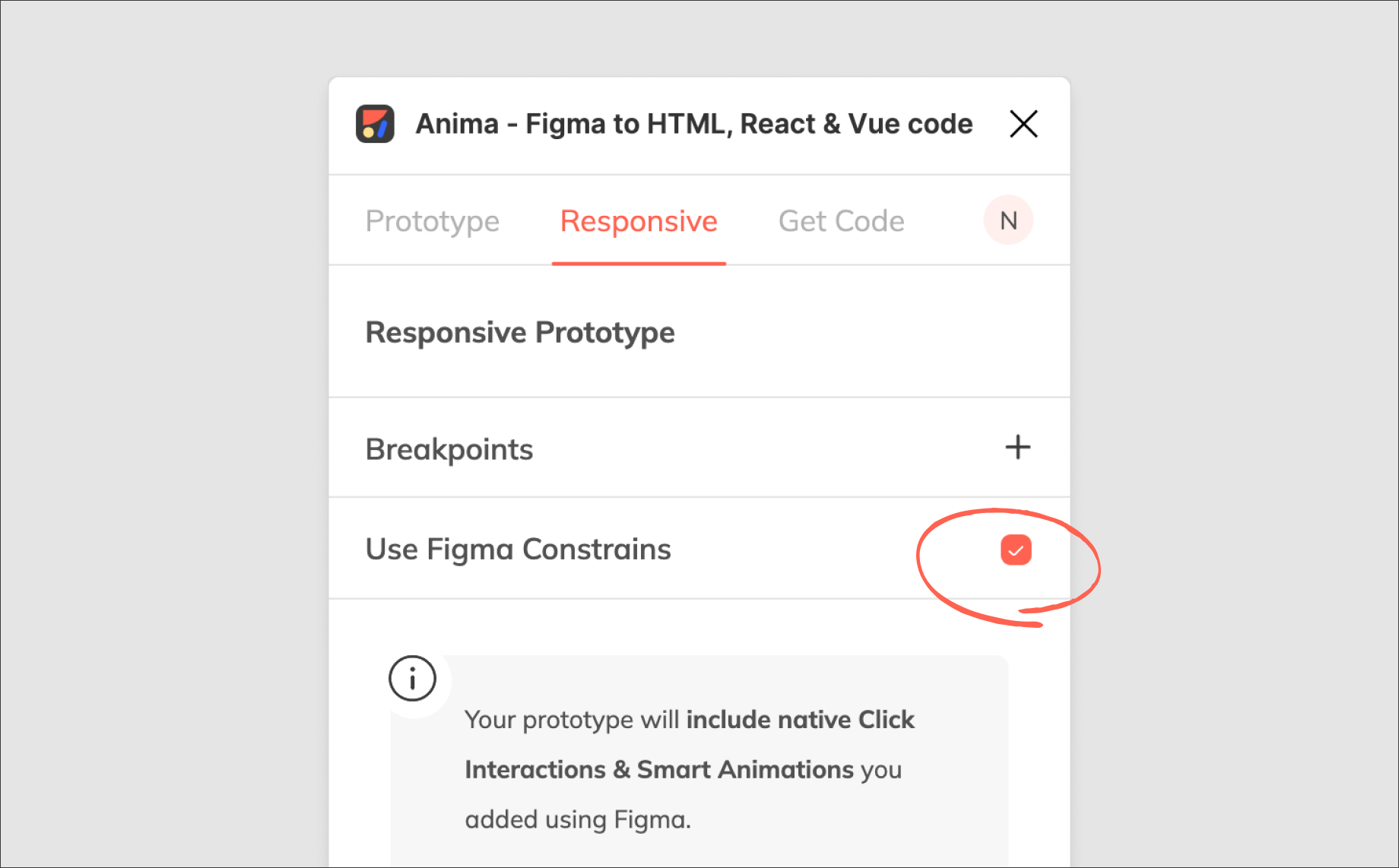
Step 3: for developers – get clean Flexbox CSS code from Anima
- Log into Anima and select the uploaded project from your dashboard
- Select the ‘Code’ option and view your clean Flexbox CSS code at the bottom of the screen
Wrap up
There you have it. Generating Flexbox responsive code based on Figma, Adobe XD, and Sketch constraints is as easy as syncing your design to Anima and letting our algorithm do the work.
It’s just another way we’re bridging the gap between designers and developers, and automating the tiresome grunt work they both dread so much.
What will you do with all the time you’ll save?
Wanna take Anima for a spin?
- Sign up to Anima
- Visit Anima 101 page
- Visit Anima’s Guides & Tutorials
