Transform Figma designs into shadcn components with Anima5 min read
Reading Time: 3 minutesTransform Figma designs into shadcn components with Anima
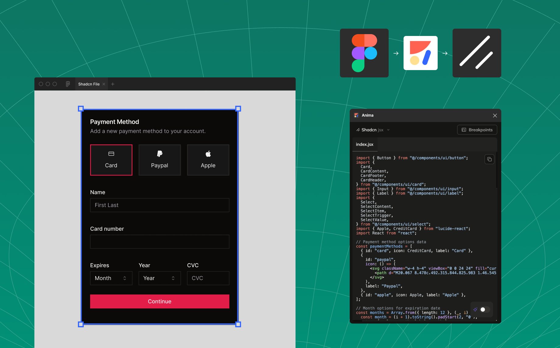
We’re excited to unveil a new capability in Anima: support for shadcn! Now, designers and developers can work together seamlessly to convert Figma designs into clean, production-ready shadcn code tailored for Tailwind CSS. With Anima’s integration, you’ll accelerate your development process while maintaining design consistency and code quality.
Highlights
Anima now supports shadcn, enabling fast and efficient transformation of Figma designs into Tailwind-based shadcn components. For the best experience, we recommend starting with the official shadcn Figma library to align your designs with shadcn components from the outset. Start creating with Anima today and elevate your Tailwind workflows!
The gap between design and development
Designers prioritize creativity and user experience, often working with a blank slate in Figma. While this flexibility fosters innovation, it can lead to challenges when translating designs into structured code. Developers, on the other hand, need to produce scalable, reusable components that align with frameworks like shadcn.
This disconnect can slow down projects and create inefficiencies. Anima bridges the gap, transforming design ideas into shadcn components with precision and speed, empowering teams to deliver faster and better.
What is shadcn?
shadcn is a modern, flexible component library built on top of Radix UI Primitives and styled with Tailwind CSS. It provides unstyled, accessible components that can be tailored to fit any design system or brand guidelines. With shadcn, developers have complete control over the appearance and functionality of their components, making it a perfect choice for building scalable, reusable, and high-quality UI elements.
How Anima simplifies shadcn integration
Starting fresh with shadcn?
- Use Anima’s Figma plugin to design layouts and components that align with shadcn’s system.
- Anima automatically generates shadcn components with Tailwind utilities, ready to implement.
Already have a project?
- Anima’s VS Code extension, Frontier, learns from your existing setup—your components, Tailwind config, and theming.
- Frontier outputs shadcn code that’s fully compatible with your project’s structure, saving you hours of manual coding.
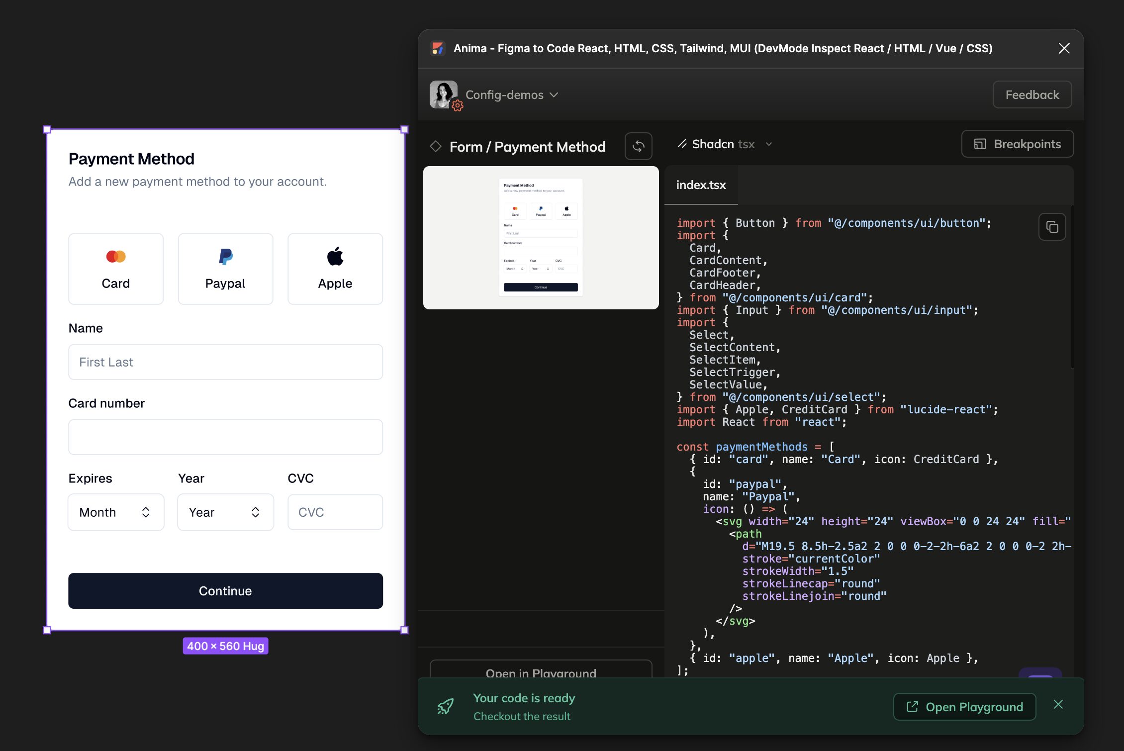
See the results: How Anima works with shadcn
Payment method
import { Button } from "@/components/ui/button";
import {
  Card,
  CardContent,
  CardFooter,
  CardHeader,
} from "@/components/ui/card";
import { Input } from "@/components/ui/input";
import {
  Select,
  SelectContent,
  SelectItem,
  SelectTrigger,
  SelectValue,
} from "@/components/ui/select";
import { Apple, CreditCard } from "lucide-react";
import React from "react";

const paymentMethods = [
  { id: "card", name: "Card", icon: CreditCard },
  {
    id: "paypal",
    name: "Paypal",
    icon: () => (
      <svg width="24" height="24" viewBox="0 0 24 24" fill="none">
        <path
          d="M19.5 8.5h-2.5a2 2 0 0 0-2-2h-6a2 2 0 0 0-2 2h-2.5"
          stroke="currentColor"
          strokeWidth="1.5"
          strokeLinecap="round"
          strokeLinejoin="round"
        />
      </svg>
    ),
  },
  { id: "apple", name: "Apple", icon: Apple },
];

const months = Array.from({ length: 12 }, (_, i) => ({
  value: String(i + 1).padStart(2, "0"),
  label: String(i + 1).padStart(2, "0"),
}));

const years = Array.from({ length: 10 }, (_, i) => ({
  value: String(new Date().getFullYear() + i),
  label: String(new Date().getFullYear() + i),
}));

export default function PaymentMethod() {
  return (
    <Card className="w-[400px]">
      <CardHeader className="space-y-1.5">
        <h2 className="text-lg font-semibold leading-none">Payment Method</h2>
        <p className="text-sm text-muted-foreground">
          Add a new payment method to your account.
        </p>
      </CardHeader>

      <CardContent className="space-y-4">
        <div className="grid grid-cols-3 gap-4">
          {paymentMethods.map((method) => (
            <Button
              key={method.id}
              variant="outline"
              className="h-20 flex-col gap-2"
            >
              <method.icon className="h-6 w-6" />
              <span className="text-sm font-medium">{method.name}</span>
            </Button>
          ))}
        </div>

        <div className="space-y-2">
          <label className="text-sm font-medium">Name</label>
          <Input defaultValue="First Last" />
        </div>

        <div className="space-y-2">
          <label className="text-sm font-medium">Card number</label>
          <Input />
        </div>

        <div className="grid grid-cols-3 gap-4">
          <div className="space-y-2">
            <label className="text-sm font-medium">Expires</label>
            <Select>
              <SelectTrigger>
                <SelectValue placeholder="Month" />
              </SelectTrigger>
              <SelectContent>
                {months.map((month) => (
                  <SelectItem key={month.value} value={month.value}>
                    {month.label}
                  </SelectItem>
                ))}
              </SelectContent>
            </Select>
          </div>

          <div className="space-y-2">
            <label className="text-sm font-medium">Year</label>
            <Select>
              <SelectTrigger>
                <SelectValue placeholder="Year" />
              </SelectTrigger>
              <SelectContent>
                {years.map((year) => (
                  <SelectItem key={year.value} value={year.value}>
                    {year.label}
                  </SelectItem>
                ))}
              </SelectContent>
            </Select>
          </div>

          <div className="space-y-2">
            <label className="text-sm font-medium">CVC</label>
            <Input placeholder="CVC" />
          </div>
        </div>
      </CardContent>

      <CardFooter>
        <Button className="w-full">Continue</Button>
      </CardFooter>
    </Card>
  );
}
Anima intelligently detects properties like size, variant, and type, ensuring the component integrates seamlessly with shadcn.
Maximize your efficiency with Anima
To achieve the best results, we recommend designing with the shadcn Figma library. This ensures your designs align with pre-built components, resulting in cleaner, more efficient code. Even if your designs deviate from the library, Anima will adapt, creating usable, high-quality output.
Looking ahead: Tailwind config generation
We’re working on new features to enhance your workflow further, including the ability to generate a Tailwind configuration file directly from your Figma designs. This will help standardize your design tokens and ensure consistency across your project.
Start building better today
With Anima’s shadcn integration, you can transform your Figma designs into robust Tailwind components quickly and effortlessly. Whether it’s a single button or a detailed UI, Anima empowers you to focus on what matters—delivering exceptional products.
Ready to take your Tailwind projects to the next level? Try Anima today and experience the power of design-to-code transformation with shadcn.


 Figma
Figma Adobe XD
 Blog
Blog