 Figma
Figma API
API Web to code extension
 Adobe XD
 Discord
 Twitter
 GitHub
 Blog
Blog
How I built a design system in Figma using MUI components4 min read
Reading Time: 4 minutesA design system can greatly benefit your process and products. But let’s be honest, building and managing a design system is extremely hard, even for large organizations with plenty of resources. So for a startup or small organization, building a design system can feel impossible.
That said, if you’re wondering how to build a design system in Figma without a dedicated team, this article is for you. Here’s an easy step-by-step guide on how I created a complete, branded design system in Figma—as the only designer at a startup—using open-source Material UI components.
How to build a design system in Figma using Material UI components
1. Select an open source library
Before we discuss how to adapt an open source library, let’s cover what open-source libraries are. Open source libraries are complete design systems used by big, established companies—and made available to the public. They’ve been thoroughly tested and optimized for users, and include complete documentation and code for developers. Open source libraries set a great foundation for anyone to easily tweak and create a high-quality, branded design system. Plus they save time and money, and cover every scenario by setting clear guidelines on how to use each component.
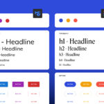
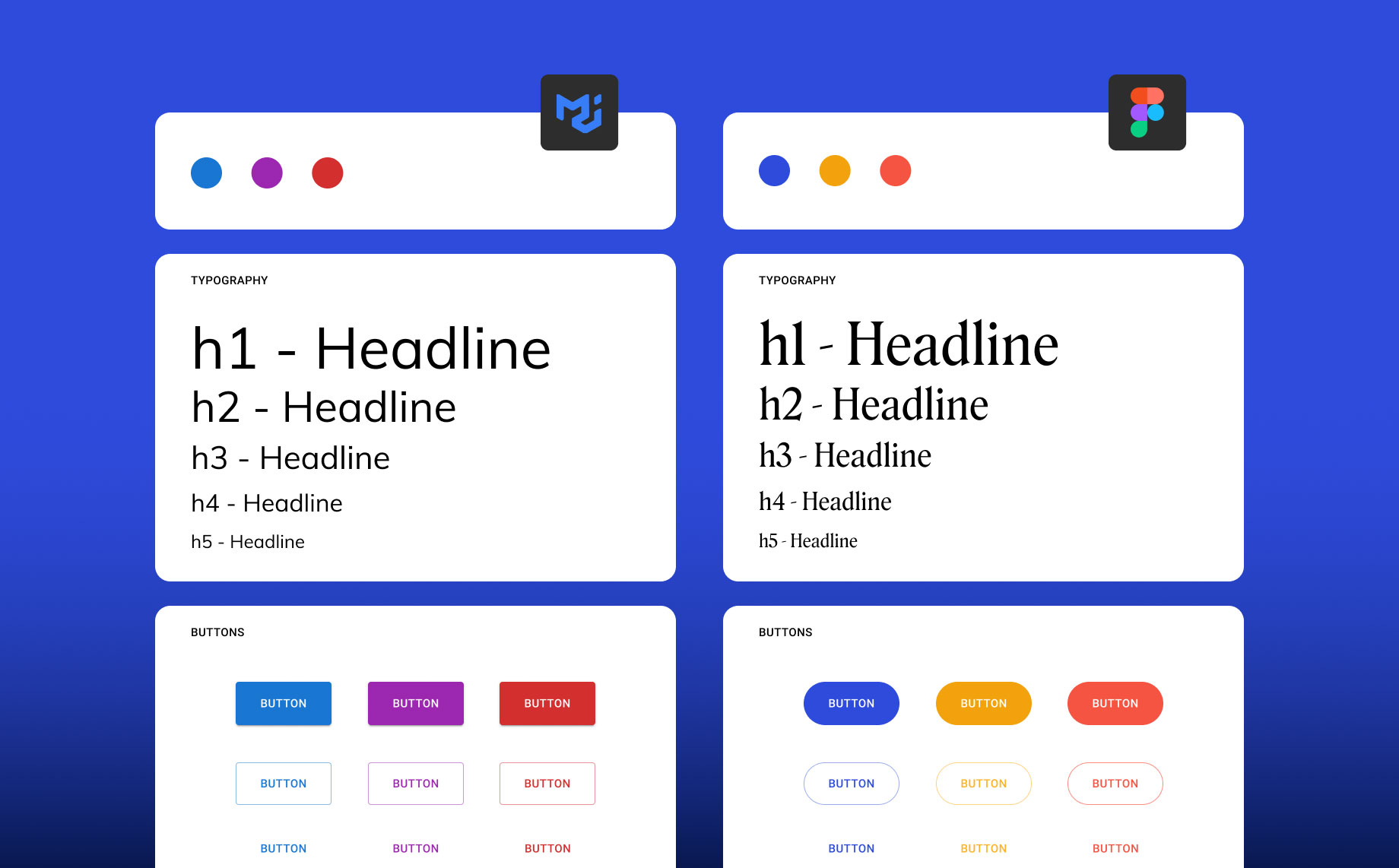
Currently, there are many reliable open-source libraries available ranging from Google’s Material Design to Polaris by Shopify. I chose Material UI (created by MUI), as it’s the industry standard for clean design and intuitive user experience. As a designer, you can easily install and customize these libraries to meet your needs. Plus, MUI is backed by open source React code that developers can implement with ease; many already use it to approximate designs.
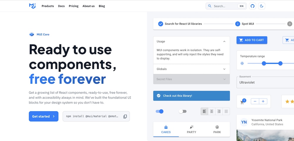
2. Install the UI kit in Figma
Begin by getting your hands on the open source component library. You can purchase the entire library or start by making a copy of the free library from the figma community. Once duplicated, you will see a collection of components ranging from Alerts to Buttons to even icons. This is the perfect foundation for you to start with.
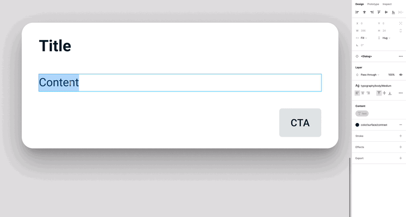
3. Customize the components in Figma
Now for the fun part: customizing and personalizing the components. Just detach the components and tweak the colors and typography to match your brand. I followed the style guide provided in the company’s guidelines, but do what works for you!
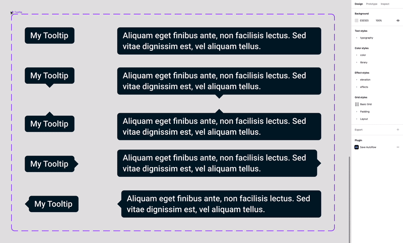
Simply select your component and play around with the design settings on the right toolbar.
You can edit the component names and the spacing. The possibilities are endless.
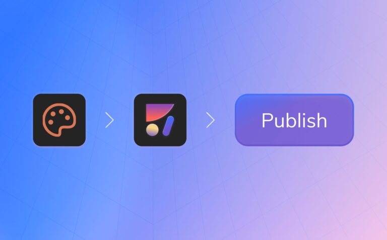
4. Share the design system
Once you’re satisfied with your design system, remember to publish it as a Figma library and connect it to your files. This way you can easily share it with your team, and with distributed teams across your organization.
5. Hand the design system off
Since we used MUI React components as the foundation for our design system, developers can easily inspect your Figma library and build it using MUI’s component code from GitHub.
With the Anima plugin in Figma, you can go a step further by turning your Figma designs directly into MUI components complete with theming. This allows you to define colors, typography, spacing, and other design tokens in Figma and have them reflected in the generated MUI code. You can customize each component, add it to your design library in Figma, and export production-ready code for your entire design system—including all themes and styles. This makes handoff and implementation a breeze for both designers and developers. Plus, each component is fully interactive, eliminating the need to plan each state or explain functionality. I wish I’d known about Anima when I built our design system!
6. Use the design system like a magic wand
With the design system created you can now easily grab prebuilt, branded components for any project. Just pick your desired component from the asset list and effortlessly create consistent designs.
Pro tip: To get the most out of your design system, you’ll need to maintain it—and keep your components and standards synced between design and production. These tools can help.
What I learned
Creating a design system is no easy task, even with a dedicated team. It requires a lot of time, effort, and resources that startups simply don’t have. By adapting MUI’s design system in Figma, I was able to quickly generate branded components that covered all possible design scenarios, and looked amazing to boot.
The impact on my team and organization was huge. With a design system in place, we were able to quickly deliver delightful, branded products without having to create everything from scratch. Plus with the thorough documentation for developers, we were able to bridge the gap between design and development. I felt confident that my designs were consistent and that developers could build them accurately using MUI’s open source code.
