 Web to code extension
 Twitter
 GitHub
 Blog
Blog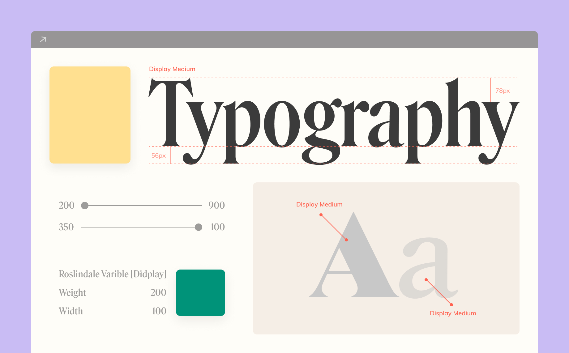
Fonts, facts and more: what is typography and why is it so important?5 min read
Reading Time: 5 minutesWhat Is Typography?
Without even realizing it, everywhere we look we see typography. It’s on every package, in every newspaper, magazine, website, and book we read. It directly affects the way we perceive and experience a product or publication. So what is this typography magic we are talking about?
The definition of typography is the appearance and style of a text, and it is also how you work with text, for example working on a project, a business plan, creating documents, etc.
Who Does Typography Affect?
The short answer: all of us.
A more detailed answer:
Typography is just like body language, the body of anything that has text on it really! You know the saying, you never get a second chance to make a first impression? This is typography!
When done right, typography gives your product (be it a book cover, a bumper sticker, your website, your app, etc.), real character. Good typography enhances the perceptions and reinforces the influence of the words.
There is a whole world of research out there and it speaks a thousand words 😉.
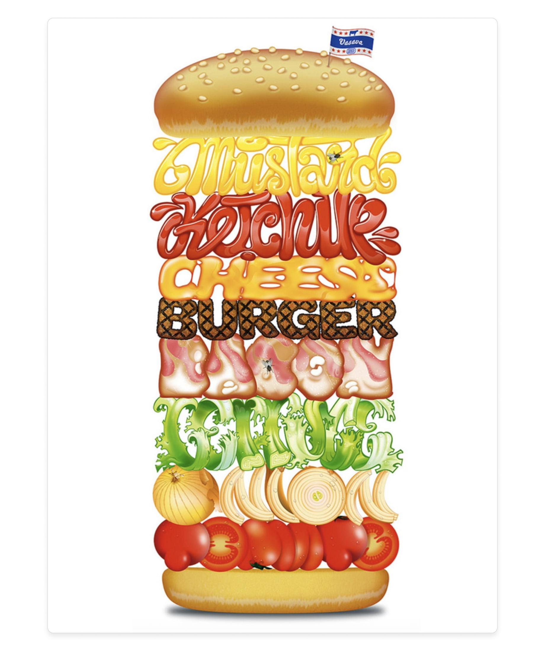
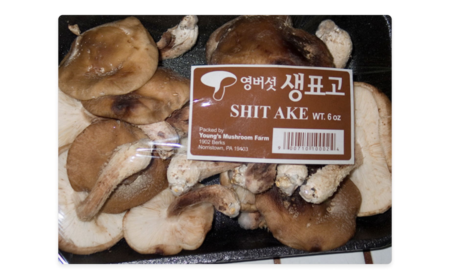
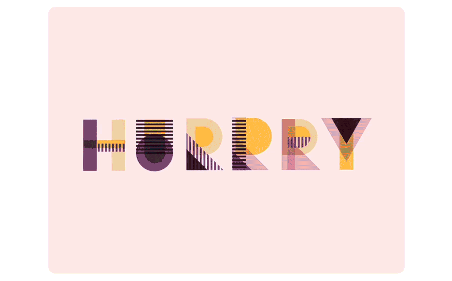
Hungry for a burger? - typography example (source)
The difference between fonts and typefaces
Although often people treat both fonts and typefaces as the same, there are differences between the two that need to be considered to get typography design just right.
“A typeface is a design style made up of characteristics such as size and weight. Fonts, on the other hand, are the graphical representation of the characteristics of the text.”
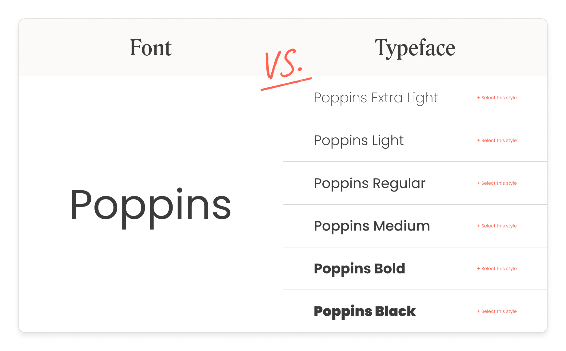
Typeface vs. font
Different Elements Of Typography
So now we know the fundamental difference between typefaces and fonts, let’s move on to these must-know eight key typography elements.
1. Kerning
Kerning is a part of typography fonts, it basically is the space between characters for every word. It is different for every word because every letter is different and fits together differently.
Some fonts are not great with kerning (bad kerning) because they can make letters appear disproportionately spaced. It is never recommended to use a font that has bad kerning.
Bad kerning - letter spacing can make all the difference! (source)
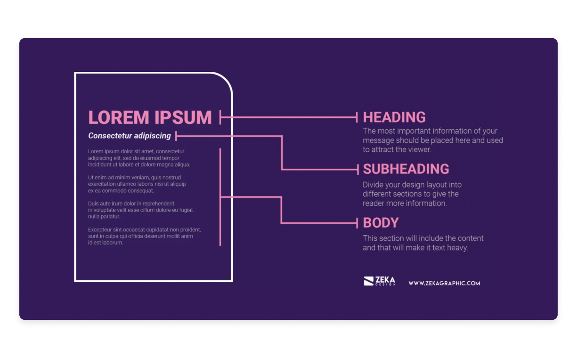
2. Hierarchy
Hierarchy is a really important principle of typography. Typographical hierarchy allows you to distinguish between the parts of the copy that needs to grab attention first in relation to the rest of the words.
It is already understood that people have a short attention span and therefore it is vital that designers build typefaces that are straight to the point and let the reader take in what is intended in the shortest time frame possible.
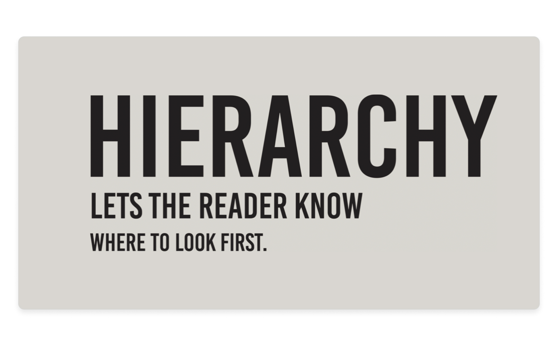
The importance of hierarchy in typography (source)
3. Alignment
Alignment is working with all of the elements of a design (copy, graphics, images, videos, etc.), and unifying them into one clear digestible page. In other words, make sure all spaces and sizes of the elements are equal.
It’s common practice for UI designers to use margins. Margins help make sure that logos, headers, footers, and so on are aligned.
Typography - alignment (source)
4. Contrast
Contrast is similar to hierarchy in that it plays an important role in conveying what message or concept the reader emphasizes on. By trying out different typefaces, colors, sizes, and styles, you can get the right contrast that will make sure the right message gets across.
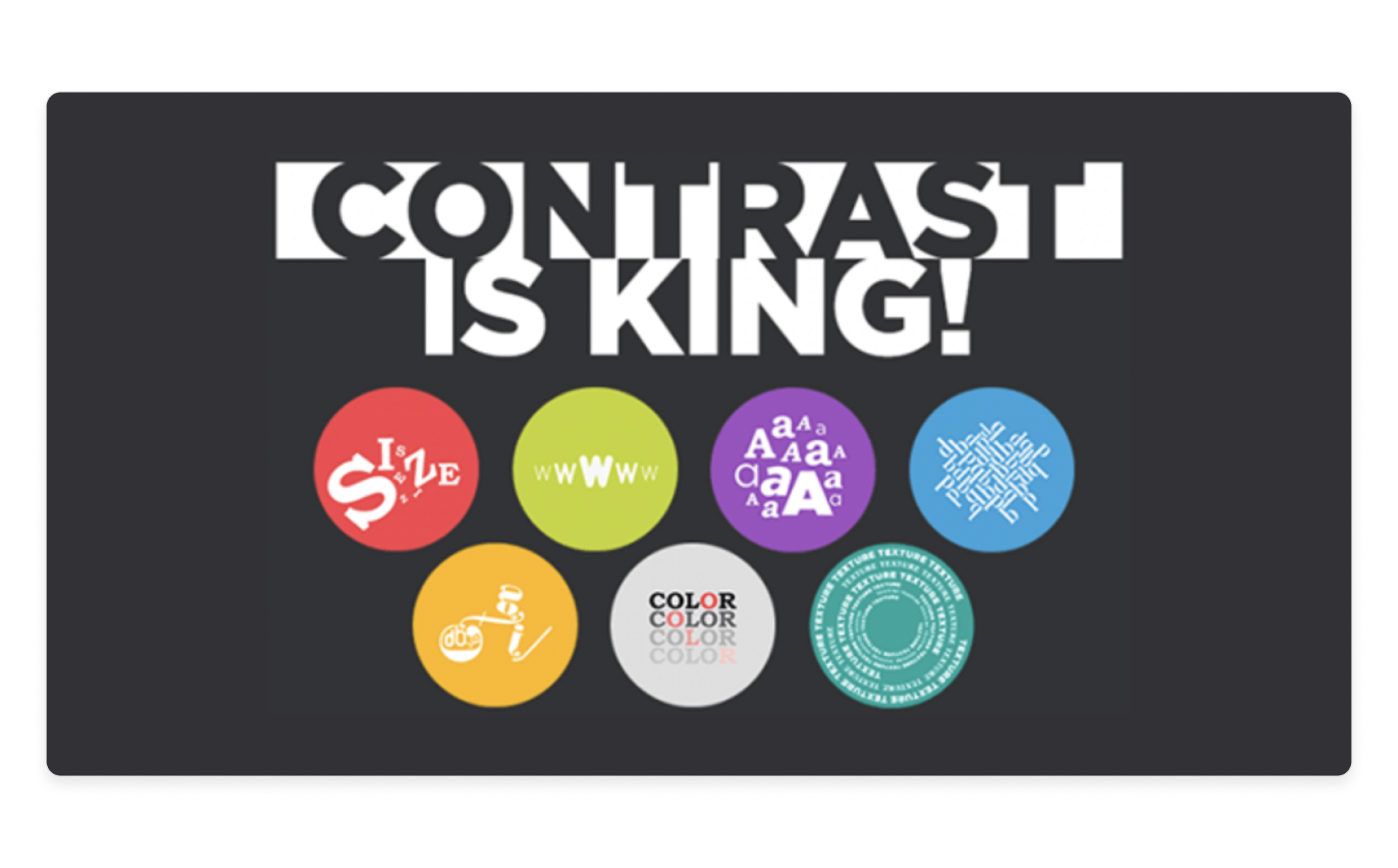
Typography examples - contract (source)
5. Color
This is one of the most fun parts of typography design, where you can really let your creative juices come out. With that in mind, it is of course, like anything in UI design, important to nail the right colors to avoid making your typography font look messy, the right color can get the message across just right.
There are three main components to color:
- Value
- Saturation
- Vue
Getting this balance right will make sure you make your typography design pop and really convey the message you intended.
Getting the color just right - typography example (source)
6. Line Length
Making a line of text just the right length is really key to its readability. Of course, design isn’t the only factor that deciphers the length of text, but it does play a heavy role in legibility.
Research suggests that the optimal line length for the body of the copy should be between 50-60 characters per line (spaces included).
Make it too wide, the reader will struggle to focus on the text.
Make it too narrow, the reader’s eye will go back often, breaking up their reading pattern, and so their attention will reduce.
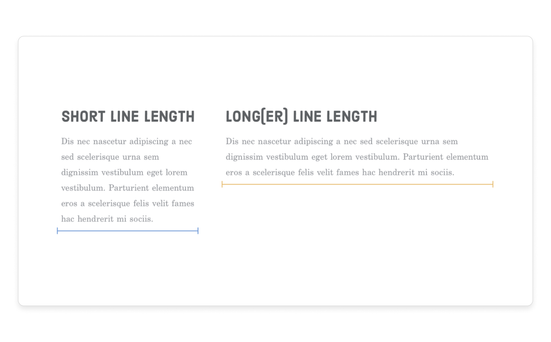
The importance of line length in typography (source)
7. Leading
Leading in typography is the space between lines of text, a lot of people know it as line spacing.
The goal of leading is to create a design where the text is easily and comfortably read. Go too big with the spacing or too small, the reader will feel uncomfortable.
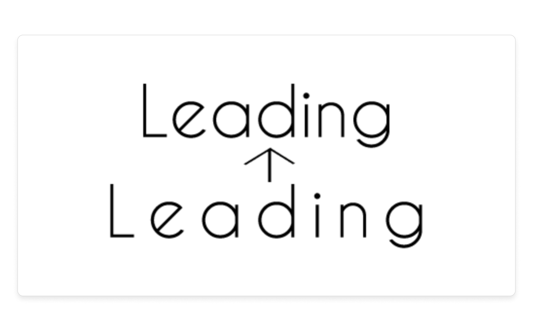
Leading (or line spacing) in typography (source)
8. Tracking
Tracking is a term used to explain the way you increase or decrease the space between letters or characters (horizontally).
Designers usually use this for fine-tuning the spacing of fonts on a website, or letters in a logo for example. This is why tracking works closely with kerning and leading.
Most designers apply tracking in increments to sharpen and finish up the appearance of an asset. It’s subtle and it really makes a difference.
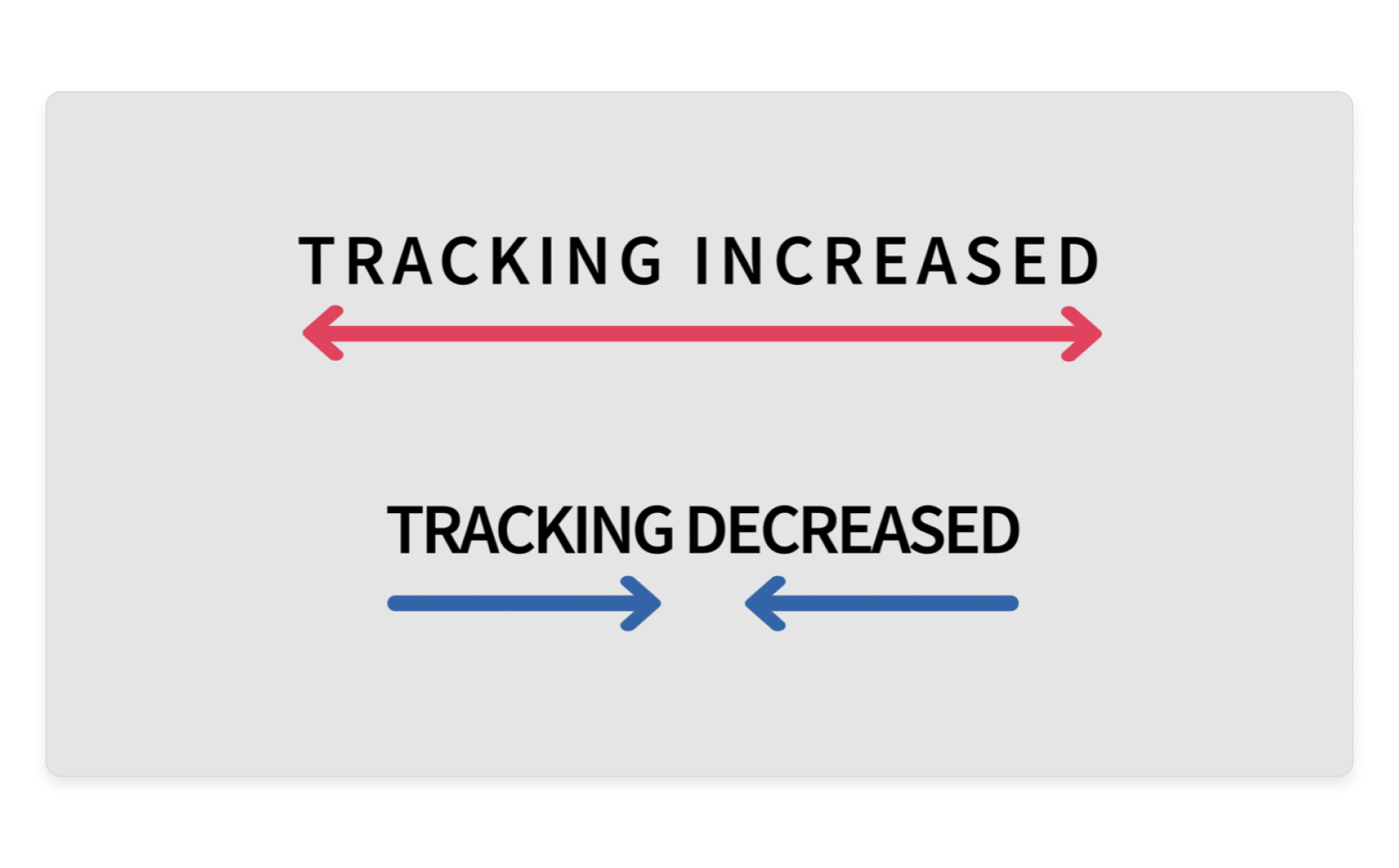
Tracking in typography (source)
Let’s wrap it up
Typography is a part of UI design that is more often than not overlooked. This doesn’t take away from the fact that it is a really important part of designing a user interface design. Getting typography just right really will set the way to making you a budding UI designer.
Use your design tool to create code-based web fonts using Anima from inside your design tool
- Get the Anima plugin for Figma, Adobe XD, and Sketch
- Sign up to Anima now
- Learn with Anima’s 101