
 Figma
Figma API
API Web to code extension
 Adobe XD
 Discord
 Twitter
 GitHub
 Blog
Blog
What is Material Design and why should you use it?6 min read
Reading Time: 6 minutesDesigners and product teams are under increasing pressure to produce top-notch digital experiences that are branded, scalable, responsive, and flawlessly intuitive—on tighter timelines than ever before.
Google created its renowned Material Design system to help product development teams do just that, while actually making those experiences more attractive and intuitive.
In this article, we’ll break down everything you need to know about Material Design and explain why it’s a must-have for your toolkit.
What is Material Design?
A complete design system
Material Design is a design system developed by Google. It was created to help product development teams build attractive, intuitive interfaces that behave consistently on any platform or device.
The system includes everything you need to build stunning, user-friendly products fast:
- A UI component library: beautiful interactive building blocks for the entire UI
- Use-specific design guidelines: instructions and layout grids that show you how to create clean, intuitive interfaces with Material components
- Customization tools: You can adjust component colors and shapes, typography, and icon styles to match your brand
- Documentation for developers: open-source code and a detailed development framework for the UI
Built on Google’s success
Google first applied Material Design to its own range of products, perfecting the system through research and user testing before releasing it to the public in 2014.
Now you can build branded products that are as clean and natural to use as Google’s. What’s more, your product will benefit from the trust and familiarity it took Google years to establish.
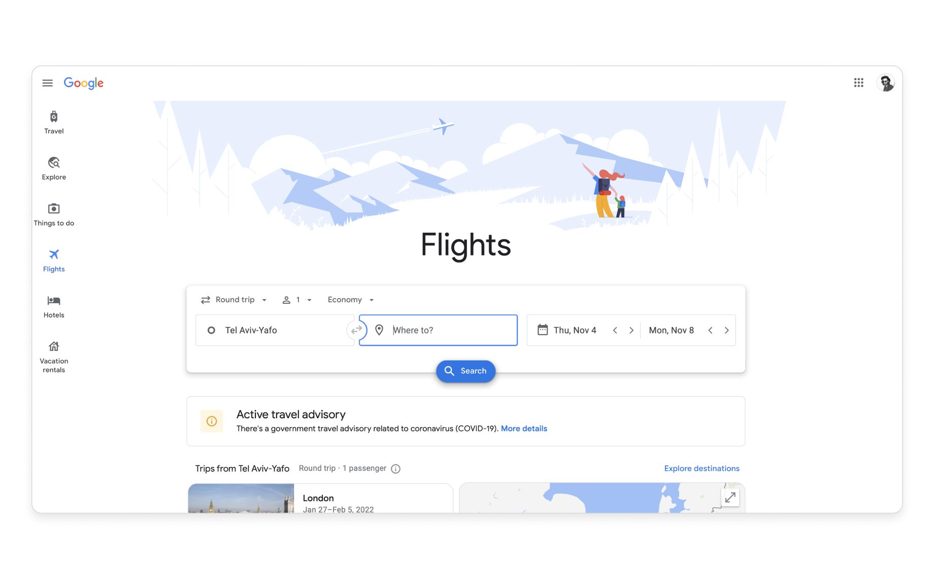
Google perfected Material Design by applying the system to its own products (Google Flights)
User interaction based on the real world
Material Design was named for the fact that its components behave like materials in the real world. Inspired by paper and ink, the subtle presence of reflected light and shadows mimics traditional print material and gives the impression that elements are layered on a three-dimensional plane.
This 3D spatial relationship creates a sense of depth and elevation, helping users understand which components are interactive (like the now-famous floating action button in the mockup below), and giving designers a way to draw attention to specific elements.
The key benefit here is that users don’t need to learn how to interact with your product, because it behaves like real-world objects they encounter every day. It also eases the user journey with a clear visual hierarchy.
Light and shadows give Material components a clear visual hierarchy
Material Design features explained
Now that you understand what Material Design is and why it’s so valuable, here’s a breakdown of the four main features that’ll allow you to make it your own:
1) Component library
The component library contains all of Google’s code-based Material UI components. These building blocks are fully functional and interactive, meaning buttons respond, drop-downs drop down, and sliders slide. It includes everything you need to build your UI, including:
- Toolbars
- Buttons
- Drop-downs
- Backgrounds
- Cards
- Sliders
- & more…
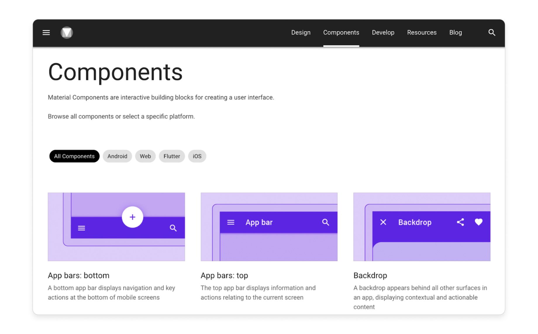
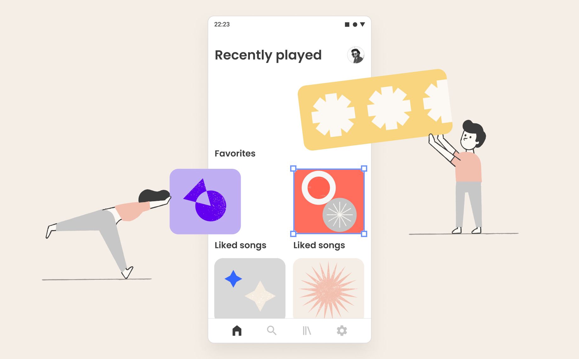
A sneak peak at Google's Material Design component library
2) Guidelines
Material Design’s guidelines are a set of usability best practices and grid layouts—perfected by Google’s design experts—that explain how to use Material UI components to create a superb user experience. These guidelines show designers how to do things like:
- Implement an intuitive component hierarchy using grid layouts
- Increase usability and accessibility with typography
- Design for different platforms and devices
- Use shadows and elevation to emphasize components
- Adjust color to maximize usability and accessibility
- Apply negative space to ease user journeys
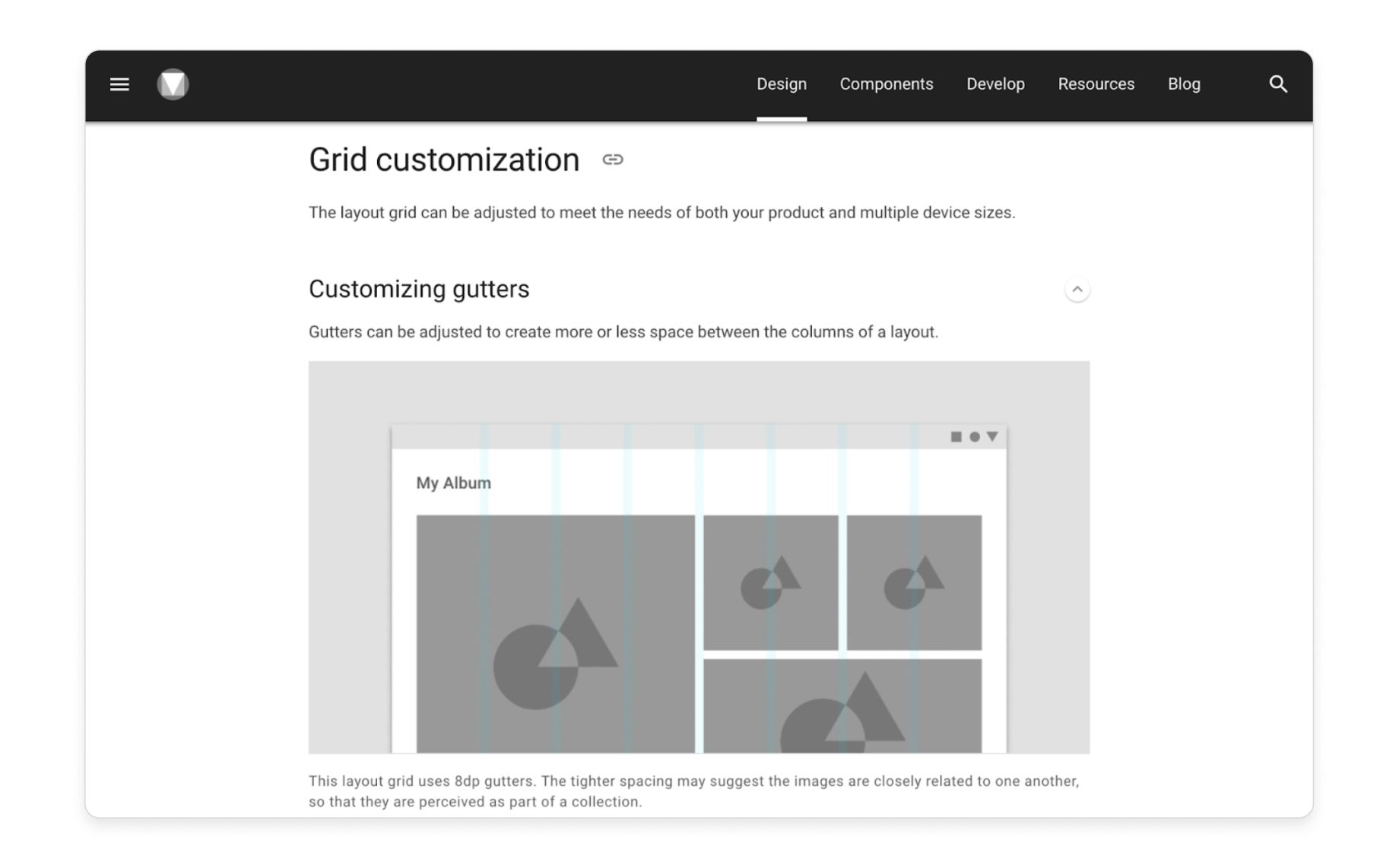
Material Design guidelines for creating responsive layout grids
3) Material Theming
The Material Theming feature lets you customize Material UI components to fit your brand aesthetic. You can then automatically apply the changes to similar components across your entire design:
- Color system→ Color guidelines help you choose a palette that matches your brand while maximizing usability, accessibility, and visual harmony. There’s also a Material palette generator that automatically creates a complementary palette around your main brand colors.
- Typography → Customize every aspect of the typography, including font, size, weight, and slope, and automatically apply your selections to specific uses (i.e. headings, button text, and menu text) throughout the design.
- Shape → Choose component corner shapes from a variety of rounded, square, and cut options, then automatically apply those shapes to all components of a similar size (i.e. make all buttons rounded).
- Icons → Select from five themed icon sets: filled, sharp, rounded, outlined, or two-toned.
The example below shows how Airbnb used Material Theming to adapt generic Material Design components to its own brand aesthetic:
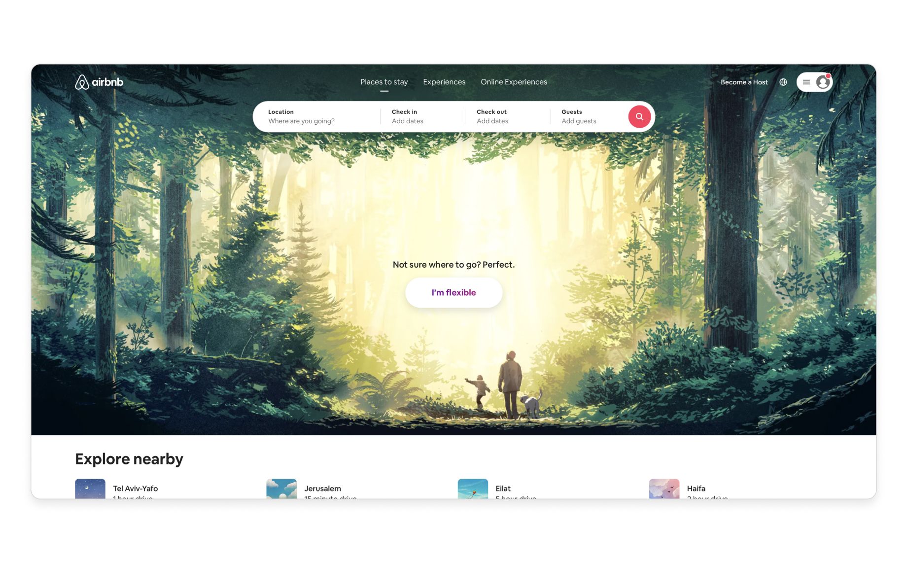
Airbnb used Material Theming to adapt Material UI components to its unique brand aesthetic
4) Functionality
Material Design components are code-based, making them fully functional, interactive, and responsive right off the shelf:
- Built-in, customizable states that communicate each component’s status (active, inactive, hovered, pressed, etc.)
- Working drop-downs, sliders, buttons, text fields, and more
- Allows designers with the right tools to create truly functioning prototypes that look, feel, and behave exactly like the final product
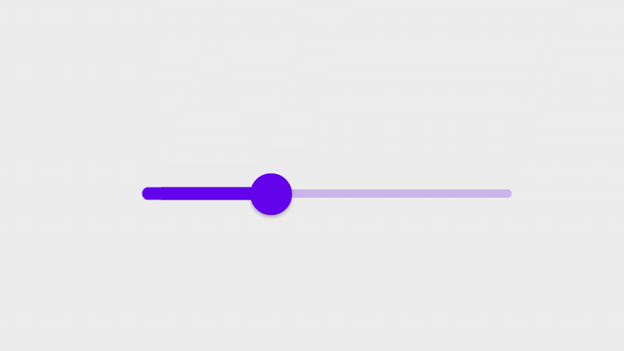
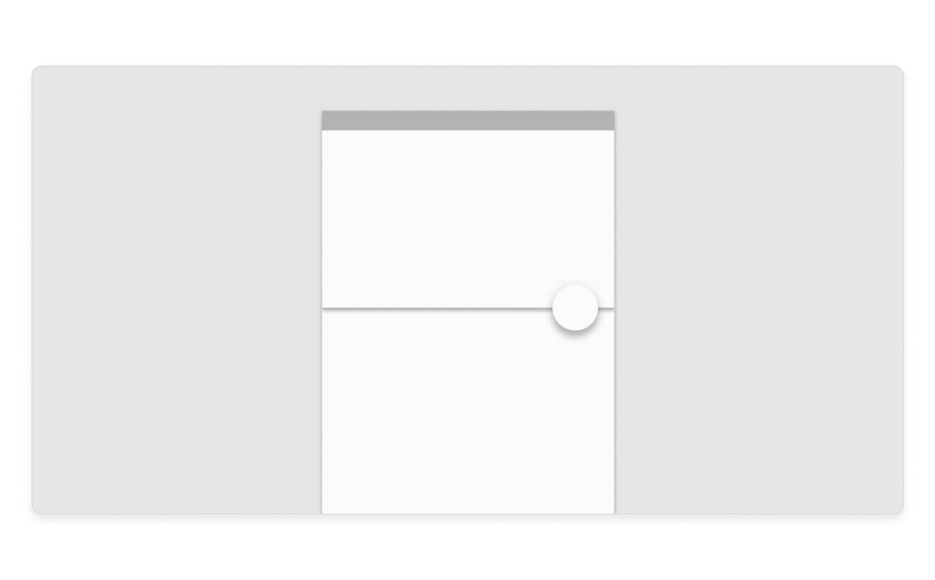
An interactive slider from Material’s component library (source)
Why Material Design is a product team’s best friend
It’s a game-changer for designers
Designers can use Material Design’s guidelines, components, and tools to build perfect products every time with less friction and more certainty. That’s because it’s:
- Flexible → Designers can build products on Google’s proven framework while using their own creativity to adapt those products to their brand’s visual language
- Intuitive→ Users already recognize Material Design because it’s everywhere, so they know exactly how to interact with it and what to expect from its components (which means fewer iterations!)
- Interactive→ Material Design components are backed by code, so they have all of the functionality you’d expect from the final product
- Responsive→ Responsive grid layouts allow designers to build products that work seamlessly on every device—with code-based components that are also responsive
- Ideal for apps→ Originally developed for Android apps (and now used on every mobile platform), Material Design is perfect for touch-based user interactions
It’s a time-saver for developers
Developers can get pixel-perfect HTML (formatting, style, fonts, image assets) from every UI building block. Developers also get complete documentation and open source code, so they can skip the guesswork and implement the UI quickly and efficiently.
It’s a problem-solver for product managers
It’s simple. Teams benefit from a proven design framework that minimizes iteration and decreases time to market—all while producing more attractive, intuitive products. This means better ROI and happier stakeholders. It’s a win-win-win.
And it’s great for users too!
Material Design has reinvented the digital user experience. Its familiar architecture has been so widely adopted that users can now navigate almost any website or app using the exact same conventions, without friction or uncertainty. And that’s exactly what designers want.
The short version
- Material Design is a game-changing Google-developed design system that helps product teams develop better digital experiences faster than ever before.
- Material Design has 4 main features: UI Components, guidelines, customization tools, and developer documentation.
- Google first applied Material Design to its own range of products, perfecting the system through research and user testing before releasing it to the public—now product teams can reap the benefits.
- Inspired by paper and ink, Material Design got its name because it behaves like 3D materials in the real world—making it natural and intuitive for users to interact with.
- Google’s Material Theming tools let designers customize Material components (color, typography, shape, icon theme) to create branded digital experiences.