 Figma
Figma API
API Web to code extension
 Adobe XD
 Discord
 Twitter
 GitHub
 Blog
Blog
How to turn MUI code components into a native Figma library4 min read
Reading Time: 5 minutesAs a Senior Product Designer, it’s a huge challenge to keep Figma components up-to-date with code components. And when Figma and code are out of sync, we lose the main benefits of a shared design system: speed, consistency, and scalability.
Thankfully, there’s a solution 🤩
Anima now converts Storybook code components into native Figma components automatically, translating everything in the code into Figma parameters. That means:
- Code props become Figma variants
- Responsive CSS converts to Figma Auto Layout, and
- Design tokens translate to Figma styles
And since Anima continuously syncs code updates to Figma, I know I’m always working with the latest version of each component. This is a complete game changer when collaborating with developers to deliver digital products, and with design systems that are increasingly complex, dynamic, and difficult to maintain.
In this article, I’ll demonstrate Anima’s Design System Automation solution using MUI code components from Storybook. You can do the same with your own design system components—or any open source design system—as long as it’s documented in Storybook.
Further reading: How I built a branded design system in Figma using MUI components
How to turn Storybook components into native Figma components
1. Run the Anima plugin in Figma
First, start by installing Anima’s plugin from your Figma file. Remember to log into Anima, select the ‘Manage Design Systems’ section in the plugin:
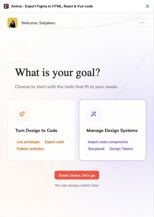
The Anima plugin welcome screen: Turn Design to Code or Manage Design Systems
Then click ‘Try with our Storybook sample’:
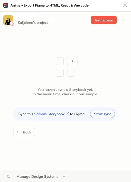
Connecting Anima's Storybook sample allows you to explore the features of the integration without your own Storybook
Once clicked, you’ll be redirected to Storybook on your browser.
2. Explore components in Storybook
Storybook is a playground for front-end UI components, so you’ll be able to play around with the variants and settings of every component, and interact with a visual representation of exactly what’s in the code. This helps you visualize the components exactly as your user will experience them in production.
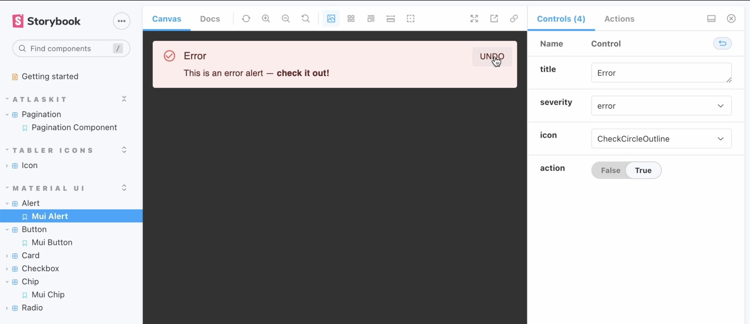
Switch between different code properties in Storybook for an accurate visual representation of each component and its variants in production
3. Import components to Figma
In Storybook, click on the Anima add-on to trigger the import. Notice that each control you play with represents a property in the code. Anima turns these properties into Figma components with variants, like different alert variants, button states, or card component cases—and maps the exact same properties into Figma’s native control panel.
Next, return to Figma and paste your Figma file’s link in the Anima plugin to connect it to your selected Storybook:
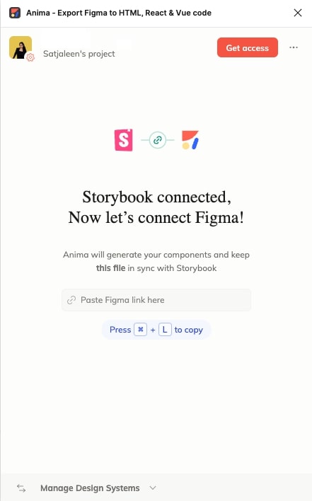
It's easy to connect your Figma file to Storybook for continuous syncing
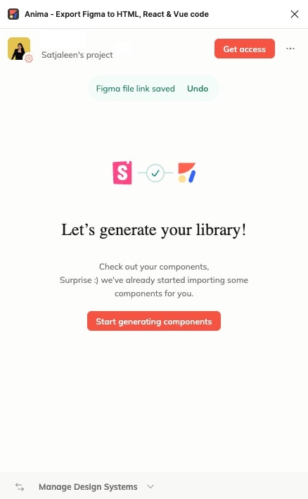
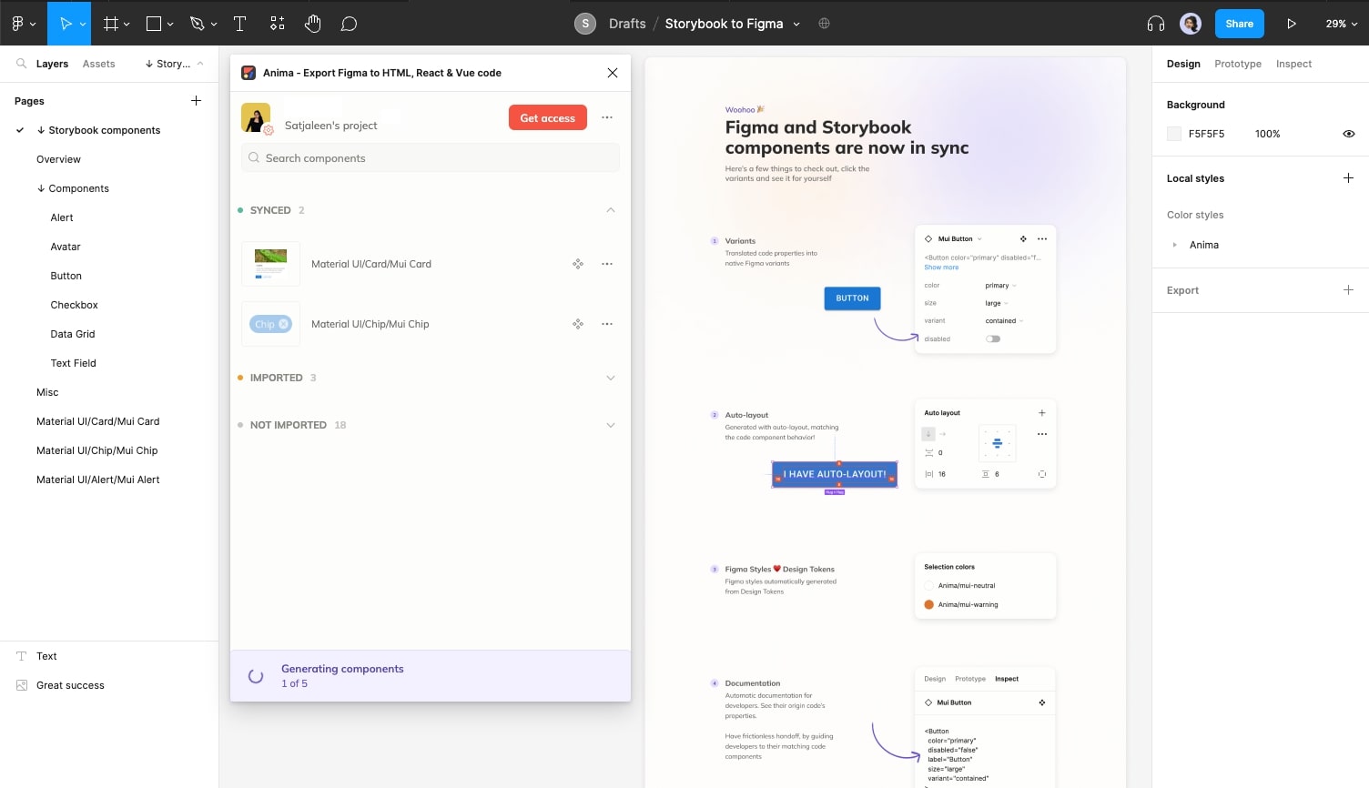
Once you’ve synced Figma to Storybook, click ‘Start generating components’:
And watch the components you viewed in Storybook generate in Figma automatically:
Storybook code components from MUI's design system generating automatically in Figma
Here’s the MUI alert component and its variants imported into Figma:
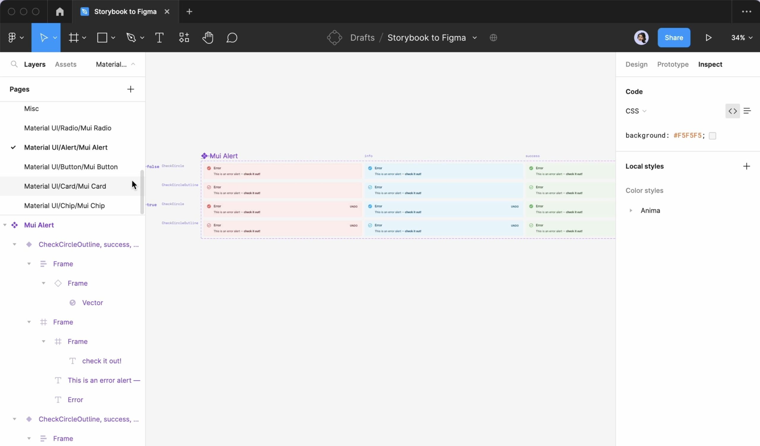
Anima imported this MUI alert component and its variants from Storybook into Figma
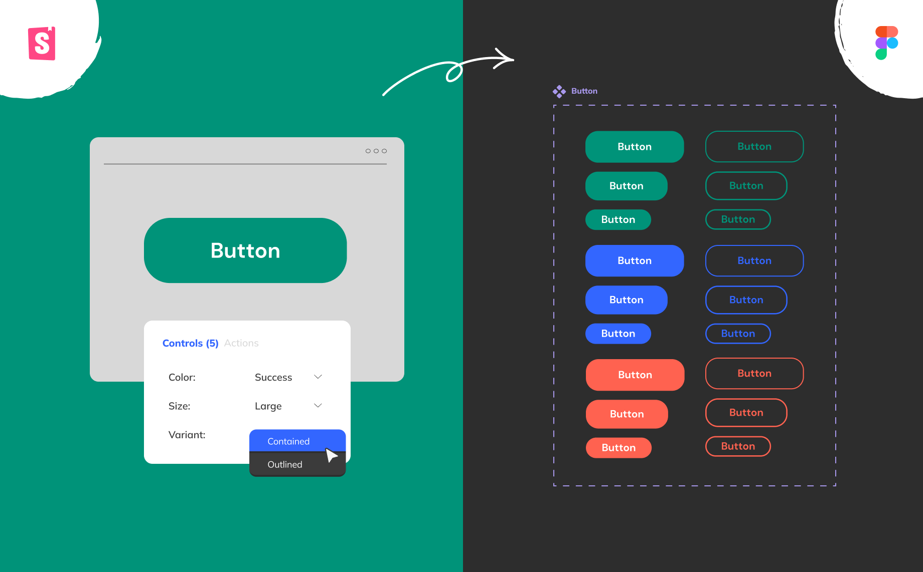
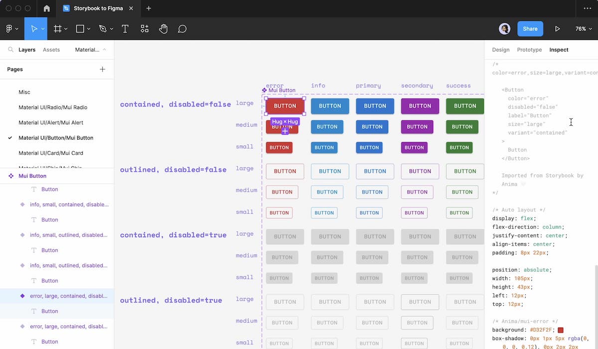
And here’s a MUI button component with all of its coded variants I imported from Storybook:
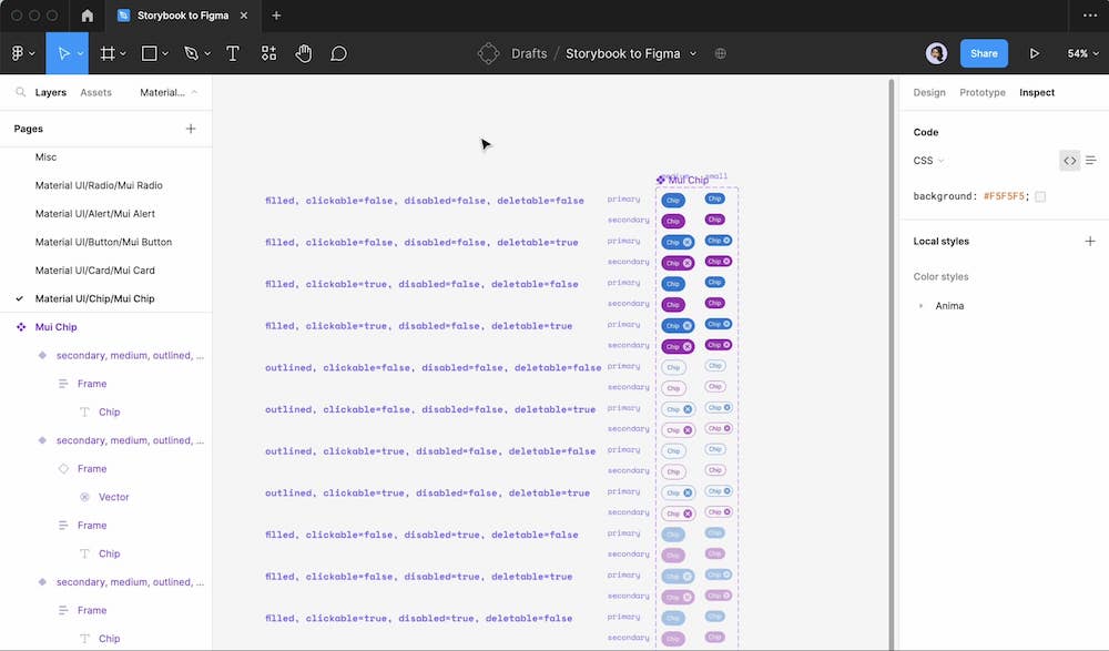
A MUI button component and its variants imported from Storybook into Figma using Anima
4. Customize the components in Figma
I find it really easy and efficient to play around with the imported components and switch between variants in Figma.
Once a component is generated from Storybook, I can easily grab an instance, adjust the Figma properties, and edit it as I wish using Figma’s native control panel.
I can also apply customizations—like tweaking the text, resizing, and changing colors as I normally would. And just as Anima converts design tokens into Figma styles, it also goes the other way: designers can change styles in Figma and automatically generate updated design tokens for developers.
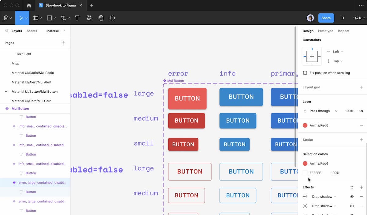
Switching between variants defined in the code using Figma's native control panel
5. Hand your design off
Anima’s Design System Automation solution makes handoff a breeze. Along with the design, developers can access code snippets and storybook links for every design system component in the flow—right from Figma’s Inspect Panel. And since Anima maintains all of the naming conventions from the code in Figma, developers always know exactly which components and props to implement.
A button component generated by Anima in Figma, with corresponding code snippets, properties, and Storybook links visible in Figma's Inspect Panel
And that’s it! We now have a Figma Library that’s continuously synced with production so we can easily grab, tweak, and design with the exact same components developers will use to build the product. This single source of truth will help designers like me create and deploy designs faster, with perfect fidelity, minimal iterations, and zero friction during handoff. It’ll even allow for rapid prototyping with interactive production components.
It’s safe to say this will change the way teams build, manage, and scale design systems—and make them sustainable at the current pace of innovation. All in all this Storybook integration will make it easier for designers and developers to deliver better products more consistently and efficiently together.
Your Figma library won’t sync itself. Unless you’re using Anima.
